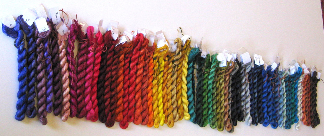
 Finally I have done something I have been meaning to do for ages, that is, I have dyed a silk thread in each of the colours in my Landscapes Dyes collection. Believe it or not that is actually 60 colours. Doesn't look like that many, does it? I think there are only 2 or 3 colours in the range that I don't have. I'll probably get them eventually, if for no other reason than completeness.
8 Comments
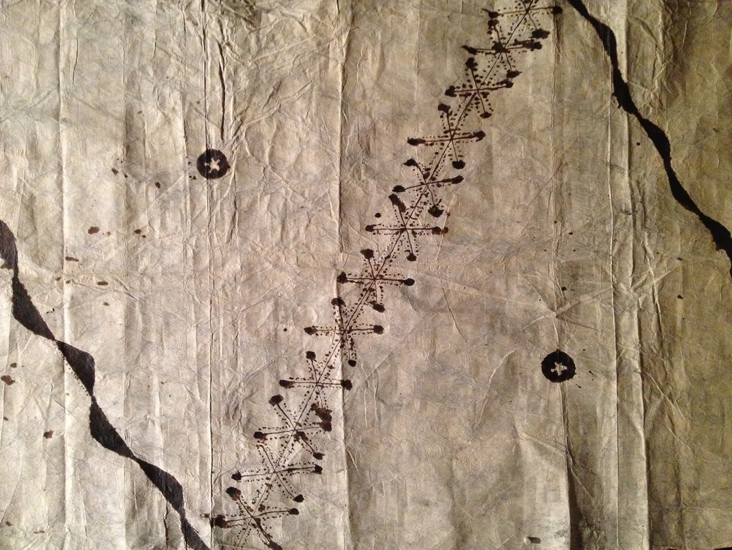
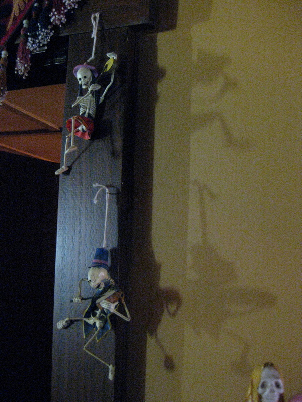
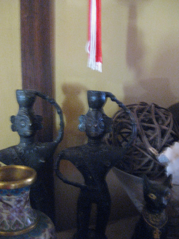
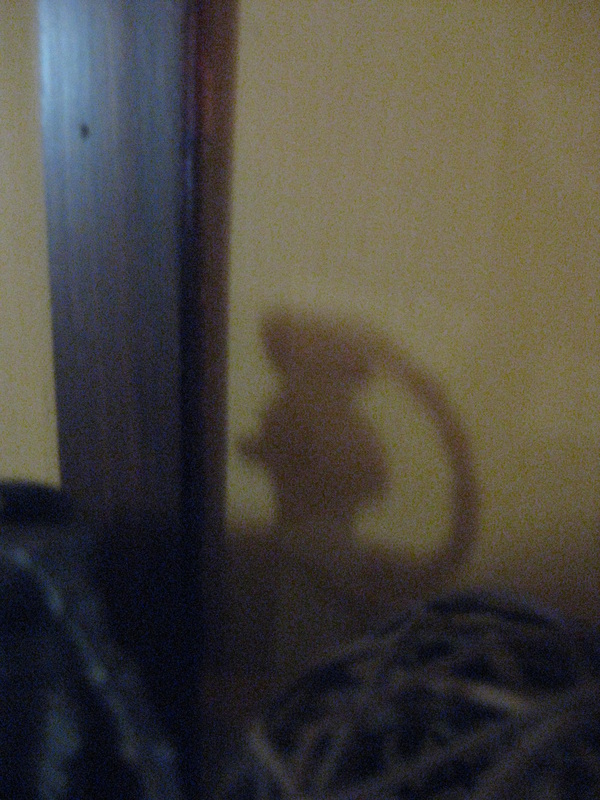
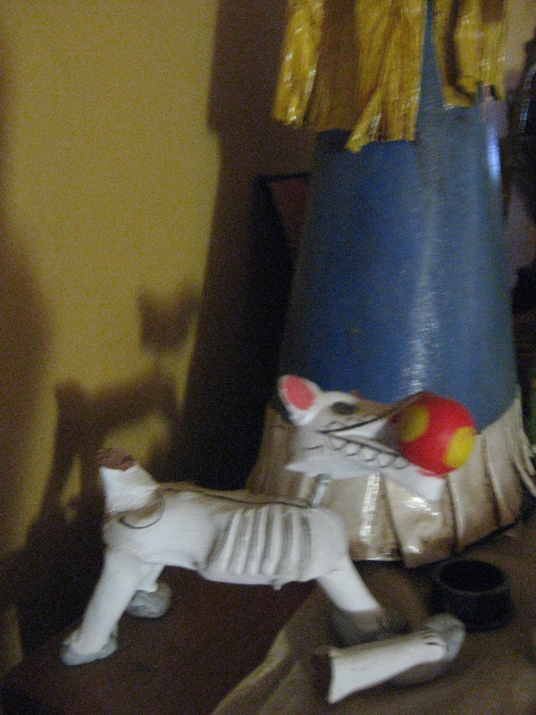
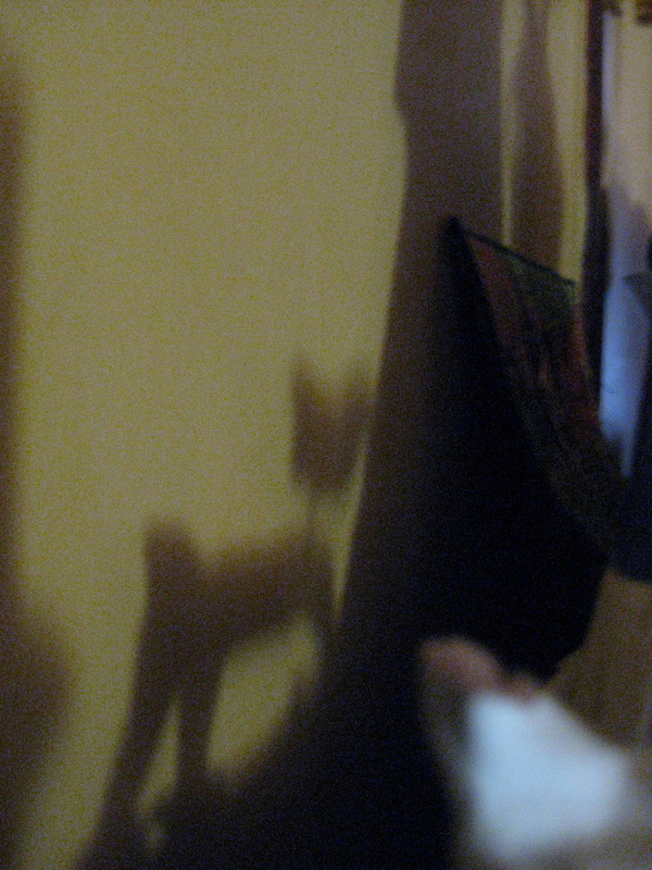
After an incredibly long day, on which I left for work at 5.45 am and returned home at 10 pm, I slept a looooong time. I rarely sleep late. In fact, I cannot remember when the last time was that I slept solidly through most of the morning. On Wednesday I slept until 11 am and woke to find the most intriguing shadows on my walls. Normally, by 11 am I have been up and doing things for several hours, and usually, would already be in my studio. With the curtains still closed the light leaked around the edges creating patterns at angles that I would not normally be there.
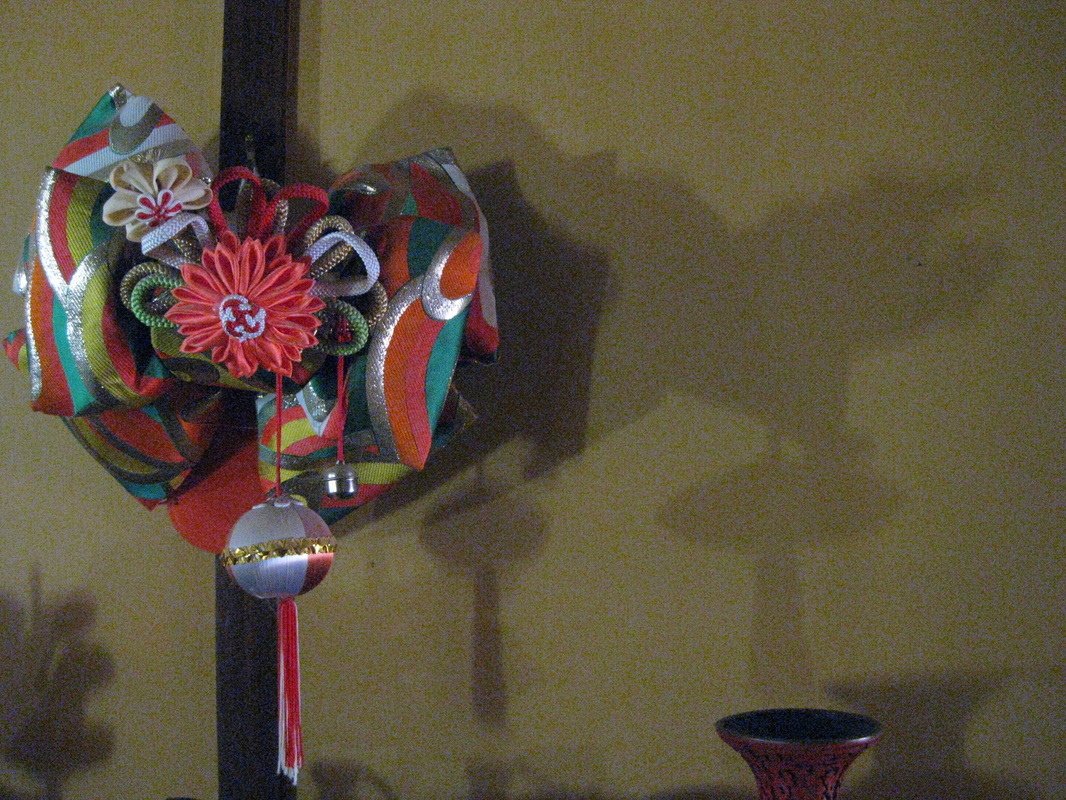
This is a child's obi bow. I love the exaggerated distortion of the second shadow. The tassel is transformed from ornament to space ship!
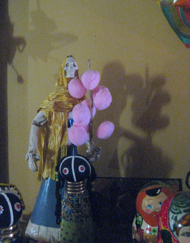
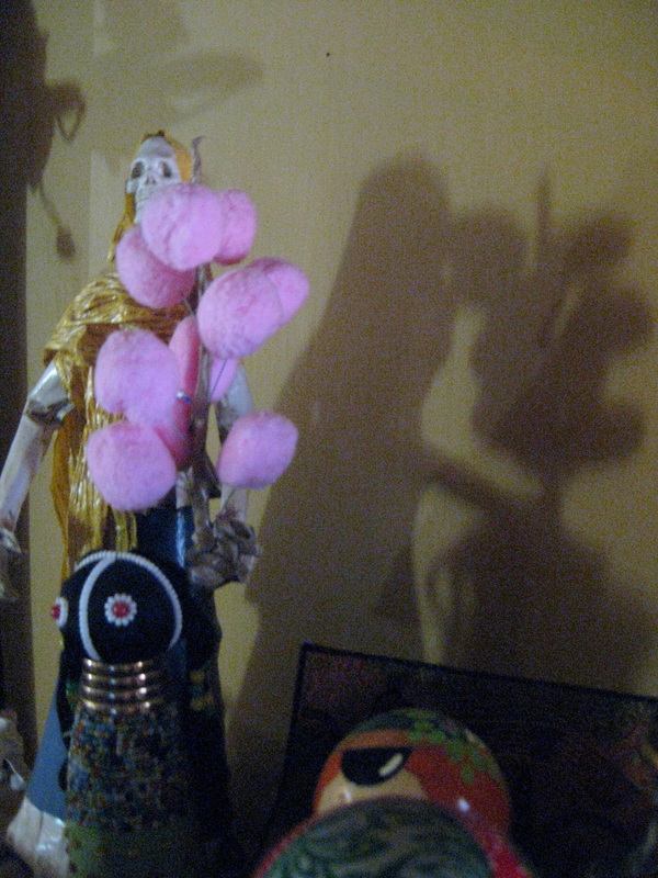
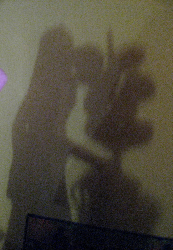
So next time you sleep in take a moment to look around. You never know what new life your ornaments may have taken on while you slumbered.
I have been working furiously these last few weeks, no, not in the studio, but painting my house. I've been wanting to renovate my little mountain cottage for years, however having unexpectedly bought my studio and then spent 6 months renovating it 3 years ago, I had to wait a while before I felt the inclination again to invest a lot of time and energy with brush and roller. Fortunately my home is much smaller than my studio and the ceilings are low, so it's not as big a job, although nevertheless it is an ambitious project. Despite spending most of my time painting I have found some time to do some art work. 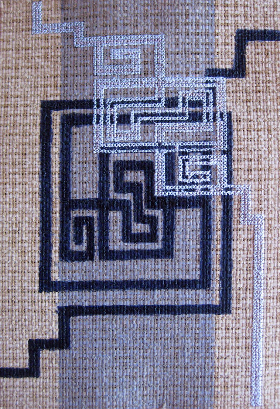
This is the third work in my current paper series (you can see the first two here). I'm thinking of calling this series "The Shapes of Life", or something....... It needs some tweaking, or maybe not. Perhaps I just need to live with the idea for a while. 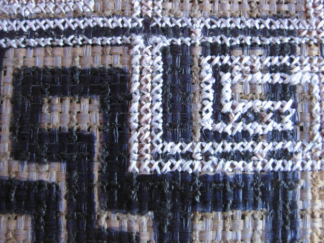
Part Greek key, part celtic, the motif represents the paths along which life takes us. We might think we are going straight, but somehow the route from one place to another is seldom direct. 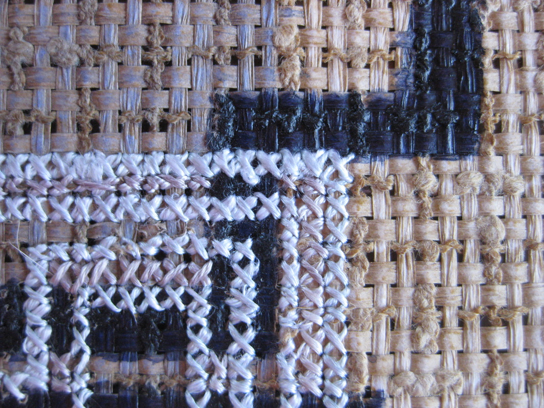
Diversions, wrong turns, wrong time, wrong place, what we want versus what we need. Sometimes we choose the path, sometimes the path chooses us. 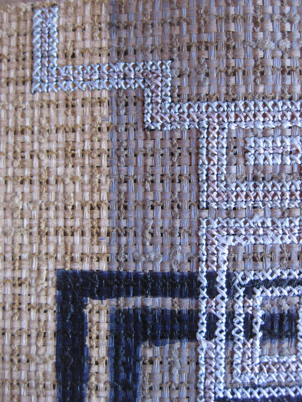
We rarely walk the path alone and so sometimes we need to let someone else lead. Sometimes we need to rescue someone, take them by the hand and walk their path for a while before returning to our own. 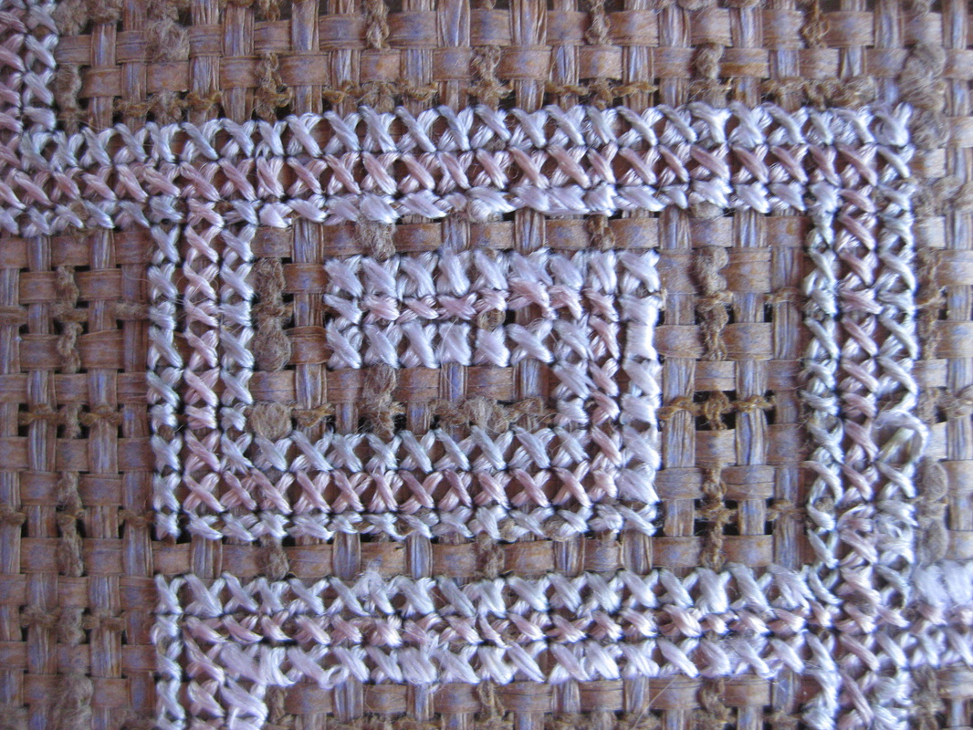
And, sometimes we just reach a dead end. Thankfully, we can usually turn around and get back on the path.
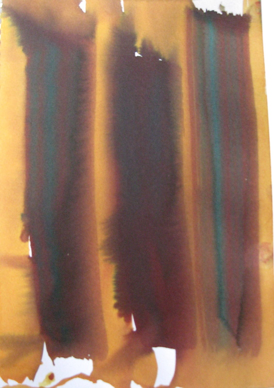
Not all paths lead somewhere wondrous. Many take us to places of pain and worry, grief and desperation. And then, sometimes it seems we can see forever, the sky is boundless and the sun is warm and that's when the path opens out and delivers us to the very place we need to be. In the end it doesn't matter what path you are on. It only matters that you keep walking. Finally back from the land of nowhere and into my creative zone! I have begun a new series and completed the first two works. Even while I was not feeling very motivated I was still working. I did the drawing below with some ink. It is based on a design on an old Japanese kimono. 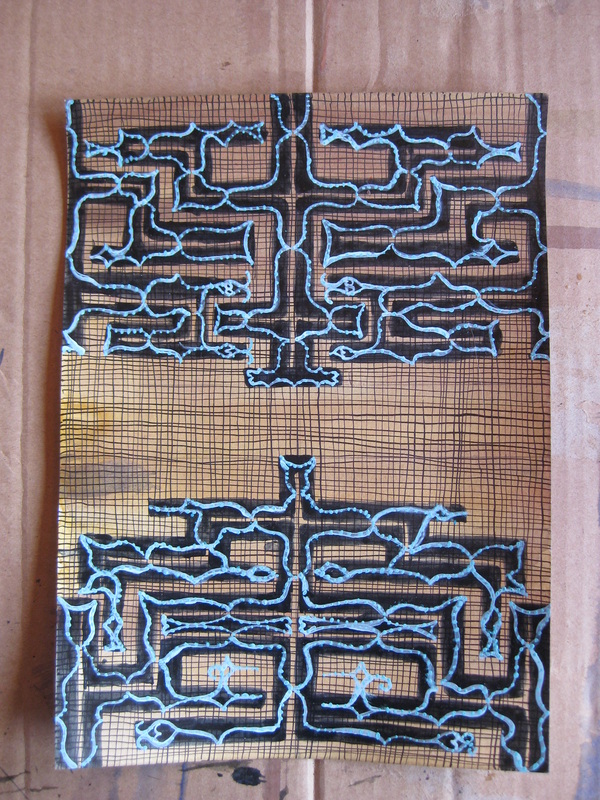
For no reason in particular I drew a grid of fine lines, well, actually I did it to get used to using a dip pen and to get a feel for how much ink it would hold. For a long while I have been thinking of doing a series inspired by the traditional crafts of peoples from around the world, which is what started me on the drawing above. I had no idea what format the works would take or how I would integrate the varying styles of folk traditions. 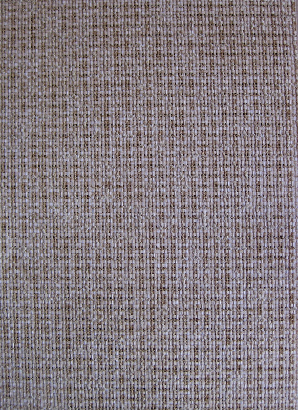
Then I found this paper. It is A4 size. It looks like woven straw mat doesn't it? But it is actually made of cotton. The woven structure makes it perfect for stitching, what with those intrinsic holes and all. 
Here it is in close up. Delicious, isn't it? I love the uneven weave and the contrasting textures of the fibres. I still wasn't sure how my single drawing would pan out into an entire series, but after spending a couple of hours in the bark cloth room at Mona the ideas started to gel (you can read about the bark cloths in my previous post here). 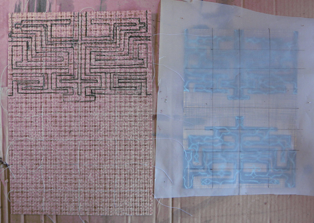
The combination of ink and stitch was going to suit this project perfectly. My first challenge was to transfer my drawing which I did by drawing a grid over the original drawing and redrawing the image onto the woven paper in ink. 
Here is the ink drawing finished. It took about 3 layers to get good dark coverage. I was really pleased with the glossy finish that so resembled the finish on some of the bark cloths. 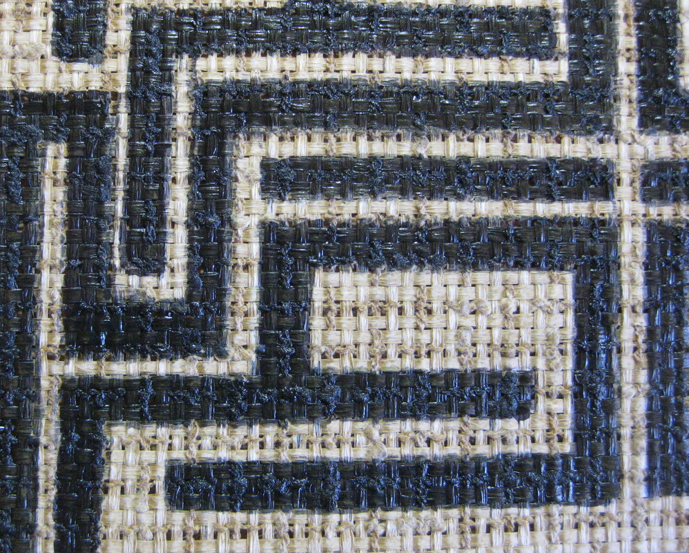
While the ink looks indigo, it is actually a very dark green. 
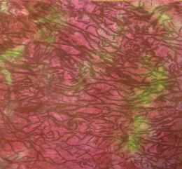
Here's the finished work. 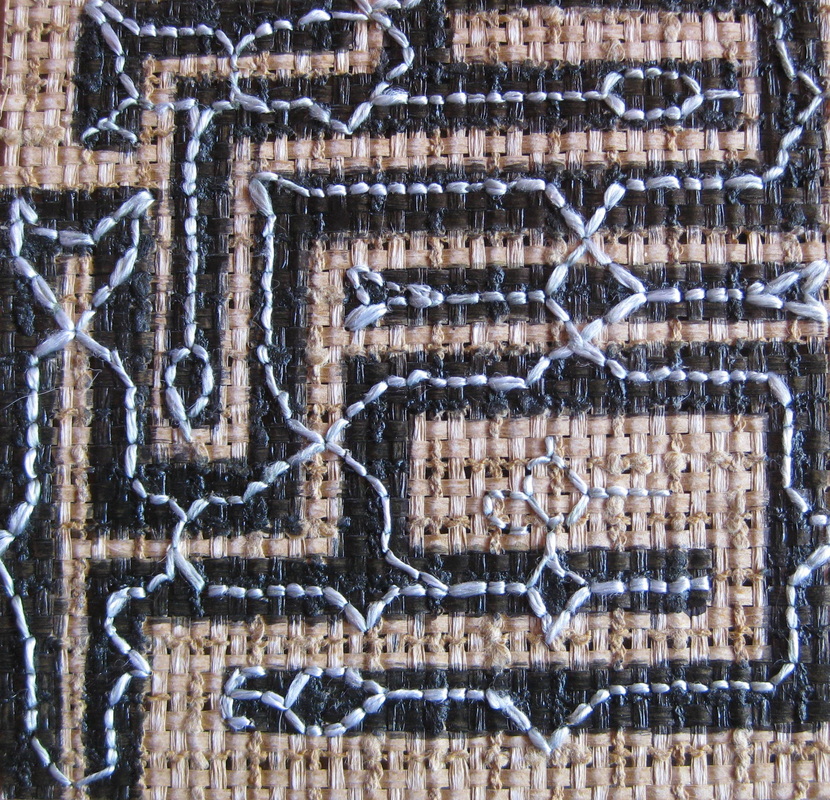
It was surprisingly difficult to stitch curved lines into the uneven weave. Fortunately, because the paper is cotton it was possible to split the fibres with the needle without the paper tearing. 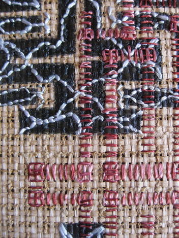
The motif on the bottom half is repeated in shadow form overlaying the 2 motifs at a 90 degree angle. 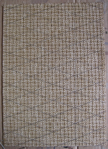
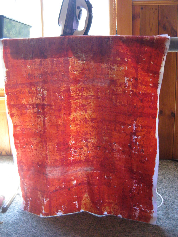
Work number 2 drawn up and ready for painting. 
Mixing up the ink to just the right shade proved difficult with my limited colours, especially the "white", which kept coming out baby pink! 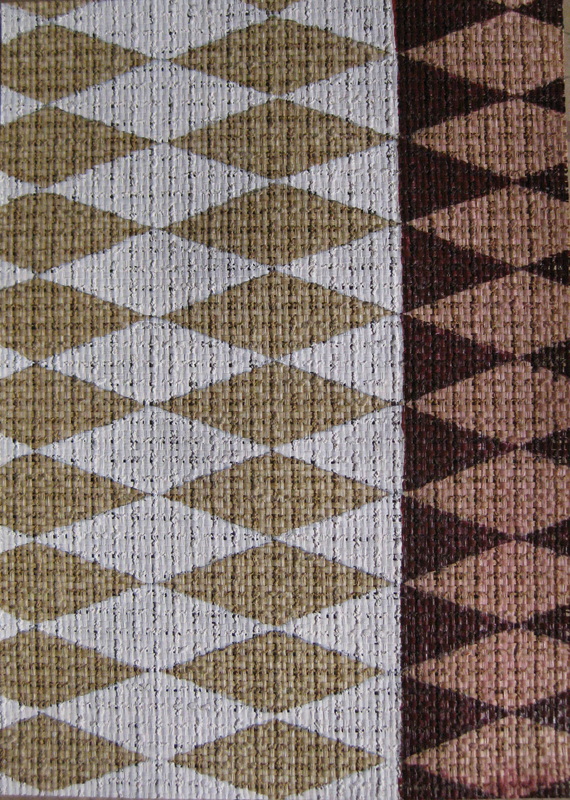
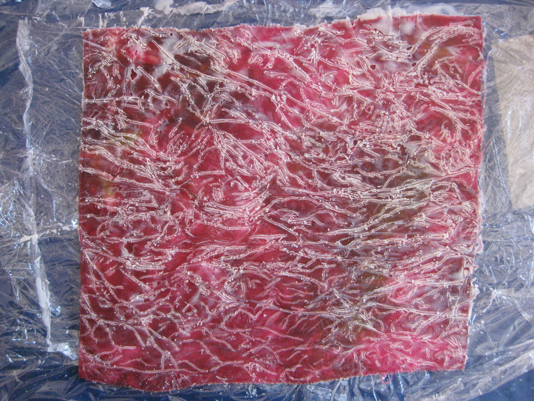
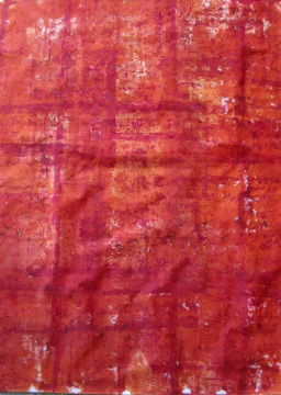
Ink drawing completed. On the red/brown side I did a very light wash over the paper before painting in the triangles. 
The white has this lovely matte chalky look.......... 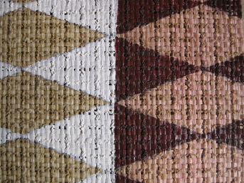
.....that contrasts beautifully with the glossy finish of the red. 
And here's what happened when my needle was finished its work. 
Love these little cross stitches. 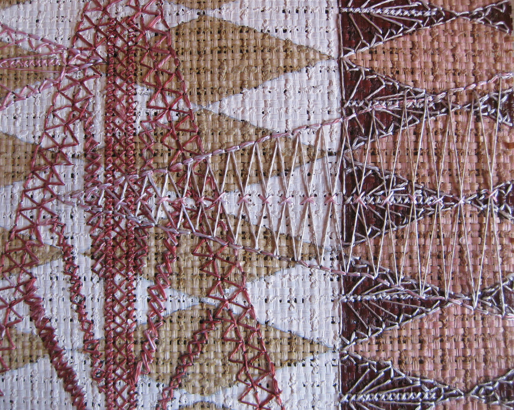
Again, overlapping shadow elements feature. 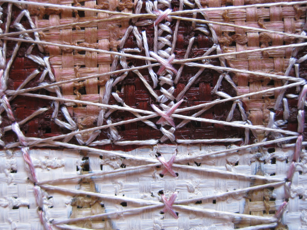
So, do you like my new series so far? I'd love to hear your thoughts.
I'm not generally one for deep personal disclosures on my blog ( I hear great sighs of relief at that!), but I have to admit that for a couple of months I have been in a hole, creatively, emotionally and psychologically. I couldn't get the motivation to go to the studio or do anything creative so I spent my time on domestic tedium and far too much time on social media getting lost in links linking to other links linking to other links etc......That's enough naval gazing. Last Sunday I decided enough was enough. I was going to get out of the house and do something to try and get motivated. My friend from long ago, bass player Nick Tsiavos and his ensemble (Deborah Kayser, soprano; Jerzy Koslowski, bass/baritone; Peter Neville, percussion, Matthias Schack-Arnott, percussion; Adam Simmons, saxophones/clarinets/shakuhachi; Eugene Eughetti, percussion) were performing his seven hour composition, Akathistos - The Machineries of Ritual, at Mona. I had been meaning to go to Mona and just spend some time reclining on the bean bags in the Bark Cloth room that is part of the Theatres of the World exhibition, so my visit had a dual purpose. 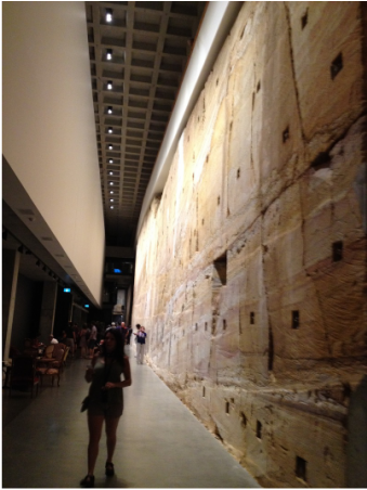
Nick's ensemble was playing in The Void, a gorgeous cavernous space dominated by a magnificent sandstone wall that is the natural wonder of this amazing underground museum. 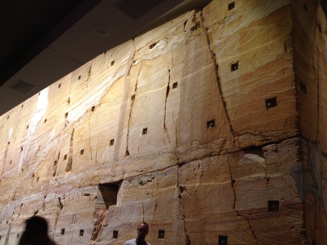
Here are a few pics of this amazing wall. 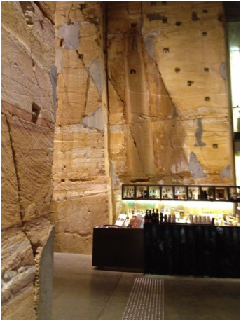
At one end of The Void there is a bar. I purchased a pot of green tea and headed down The Void to settle on one of the antique chairs to listen to some music. I arrived at about 10.45 am so I hadn't missed too much of the performance. From the very first I was entranced. I expected the work to be good, no, I expected it to be very good. What I didn't expect was to be totally blown away, so much so that I seemed to be transported away from my self absorbed blues and into a zone of inspired mesmerisation. Akathistos is nothing short of a triumph! (Parts of the work have been recorded as Akathistos Fragments. You can read a review of the record here and if you are so inclined, the CD can be bought here. It is also available on iTunes.) 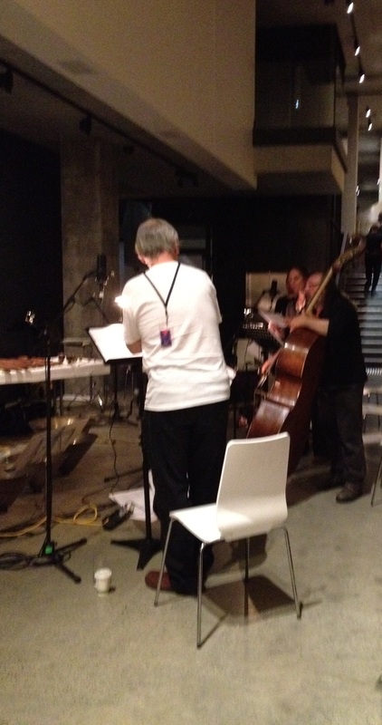
Above: Nick Tsiavos, Bass; Jerzny Kozlowski, bass/baritone, Deb Kayser, soprano. According to Fordham University, the Jesuit University of New York, " The Akathistos hymn is the most famous Byzantine hymn to the Virgin Mary. ...... devotion to the Mother of God became central to the Identity of Constantinople in the sixth century, when she was taken as the protector of the city. This hymn expresses that devotion." Nick Tsiavo's Akathistos is a contemporary imagining of that great Byzantine chant. Nick commented that "the priests would have his head" for his interpretation. I believe it is a powerful devotion for the modern age, evoking the spirit of Byzantine Constantinople in the context of our present time and place. It seemed most fitting that this expansive work was being performed in what could be described as a modern secular cathedral. 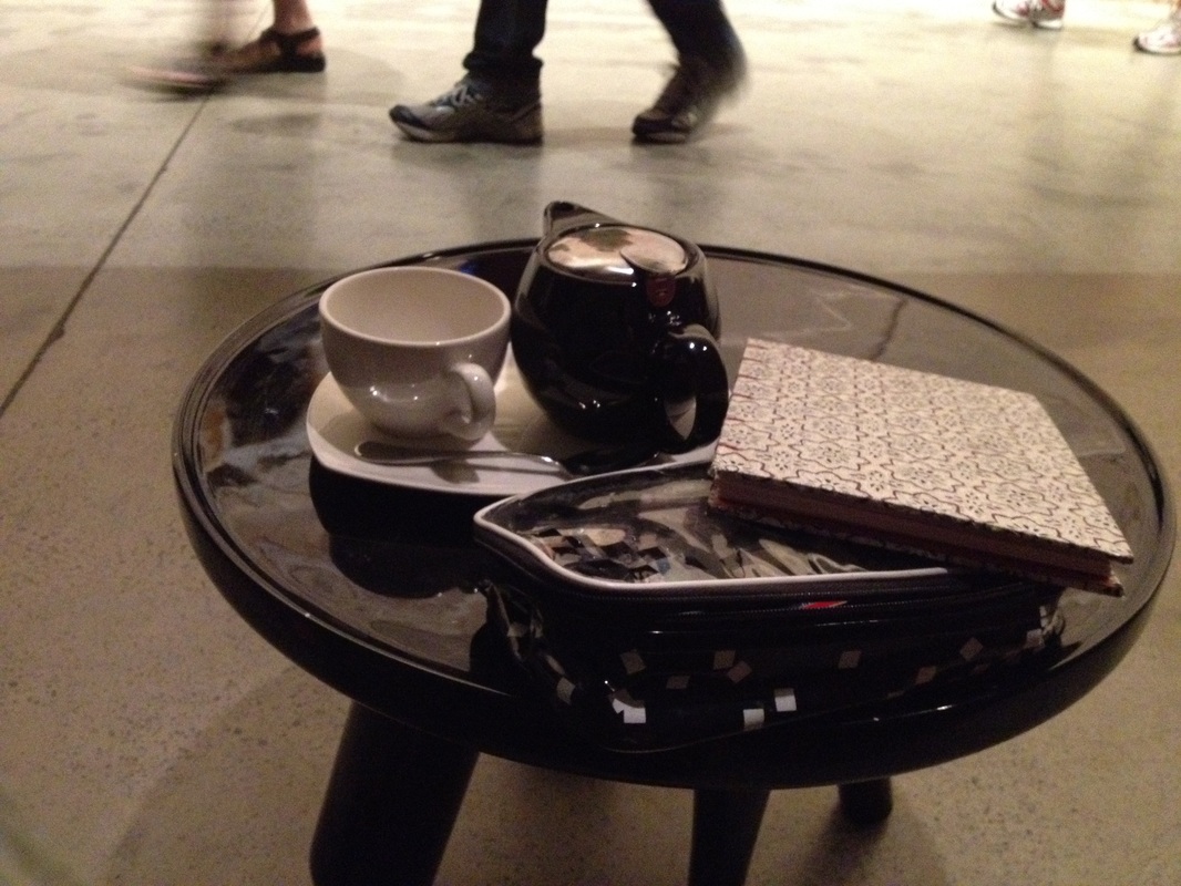
As I sat, sipping my tea I picked up my sketchbook and drew some of the patterns in the sandstone wall. 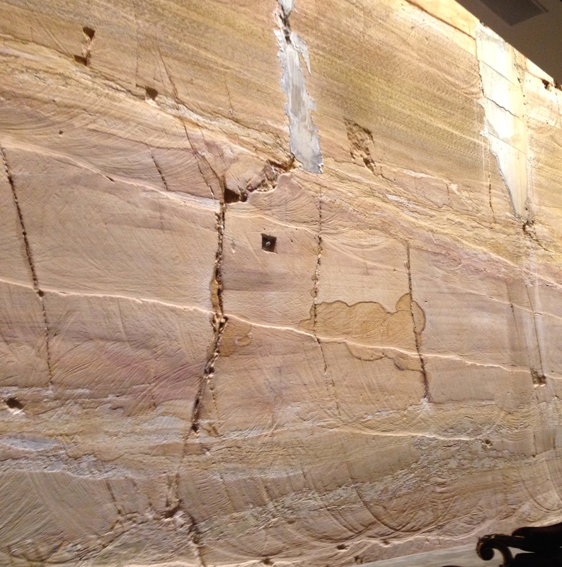
Although I have photographed the wall before, I had never spent such an extended period just looking at it. I decided to get up and photograph it in much more detail. In the photo above you can see the machining marks made by the enormous drills they used to carve out the cavern. They add a further dimension to the natural patterns and textures of the stone. 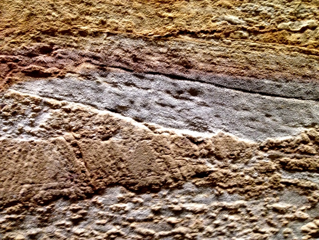
Up close you see the variation in colour and texture in more detail. 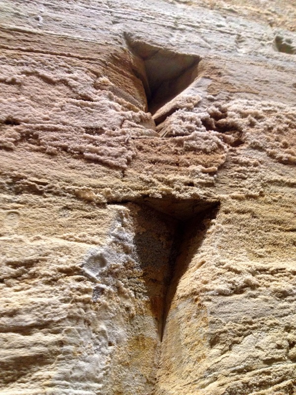
These triangular divetts occur at varying intervals along the wall, I presume they had some function during construction. Providing anchoring points for machinery, perhaps? The furry look to the stone is actually salt precipitating out on the surface. 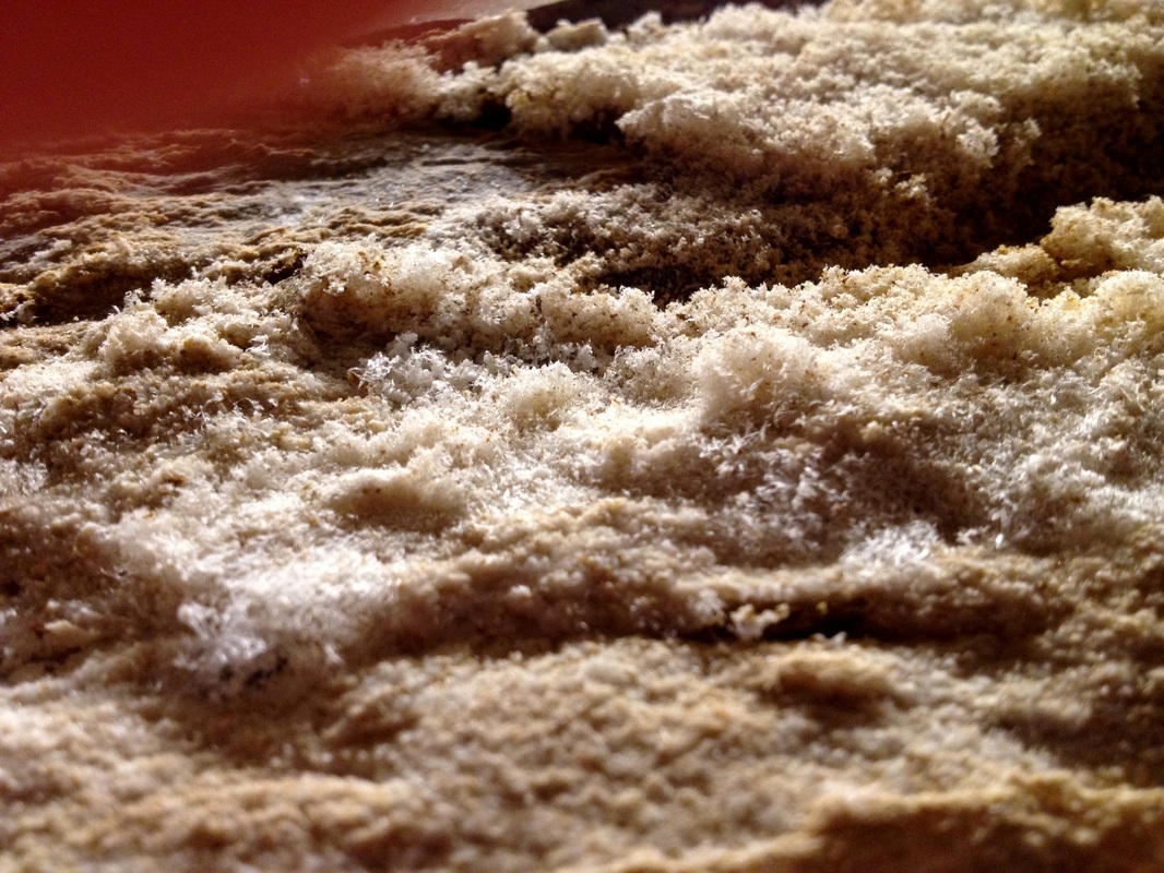
The salt crystals create interesting shadows..................... 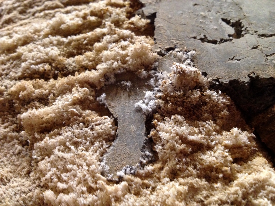
....and grow around and onto sections where faults have been cemented providing a strong contrast between the natural and the man-made. 
above: One of the numerous giant bolts that give the wall its stability. ....and as I wandered around photographing the wall I was enveloped by music reverberating off every surface. 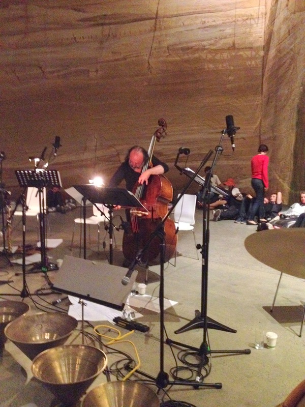
Above: Nick performs his 40 minute bass solo In the 40 minute bass solo Nick explores the full richness of expression his instrument can yield. Bell like harmonics bounced around the towering walls. Col legno passages (where the string is struck with the wood of the bow) rang like droplets splashing into a silent lake. It sounded as though the walls themselves were making the music, like nature itself was speaking. As I listened thoughts streamed through my head, I wrote in my journal "How can sound shimmer? Is this the sound of light?" 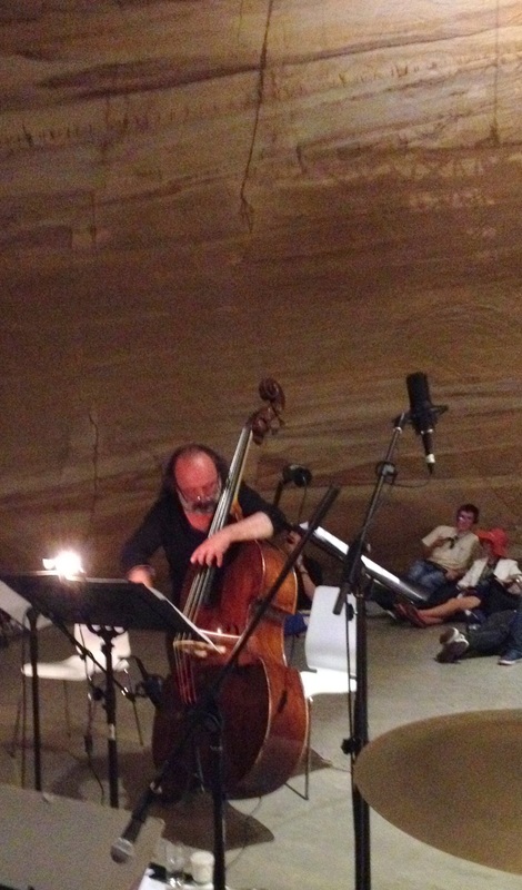
As Nick played I also watched the audience. People passing through the hall stopped dead in their tracks as they marvelled at sounds they could not imagine coming from a double bass. 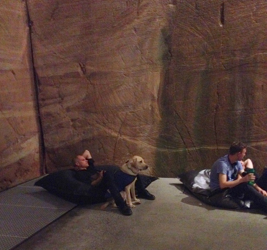
Above: A trainee guide dog sits enraptured. I swear that dog did not take his eyes of Nick the entire time he played. 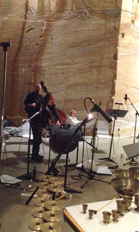
And always that wall, sentinel and performer both. 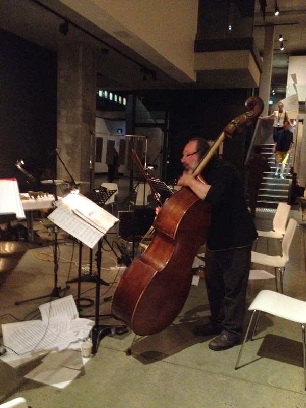
I love the pile of sheet music on the floor. At this stage we are only about 3 hours into the performance. 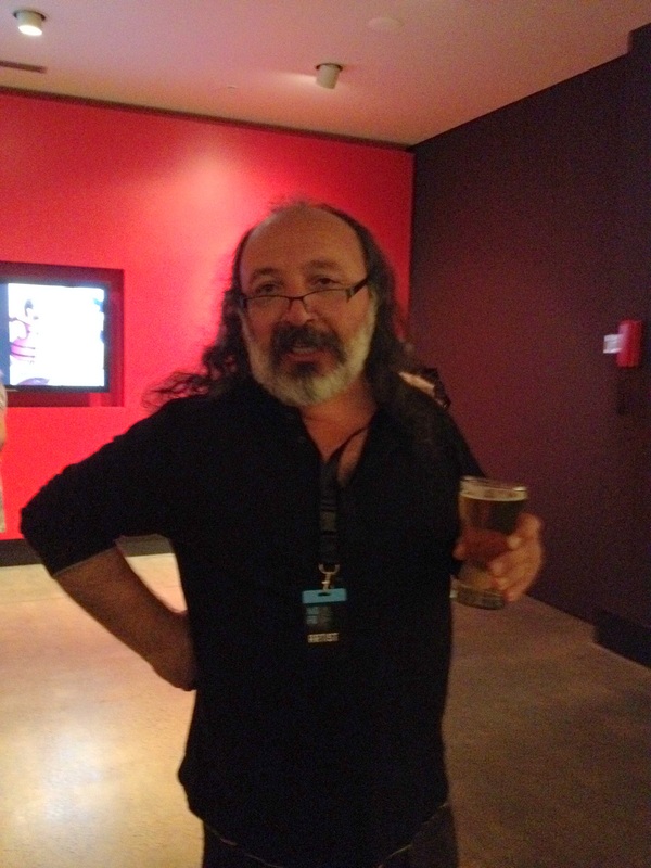
Nick enjoys a beer at The Void bar after his solo, while we chat and the other performers in the ensemble continue playing. 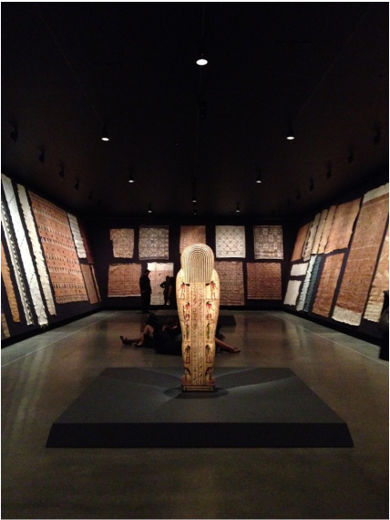
Above: the bark cloth room as seen when entering. I had no concept of how much time had passed, but my brain was starting to feel overloaded. I looked at my phone and I had been listening for 2 and a half hours. It was time to give my auditory cortex a break and go activate my visual cortex. I headed for the bark cloth room and took up residence on one of the bean bags. 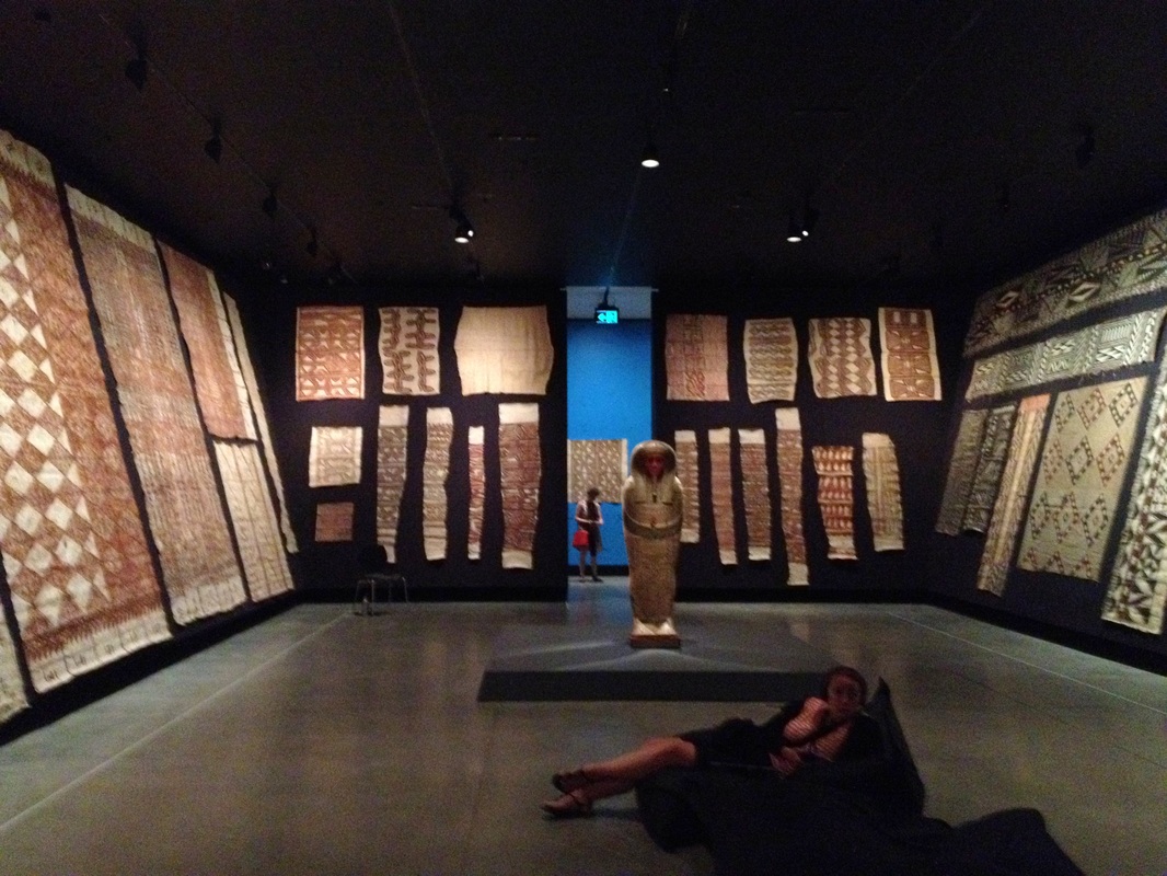
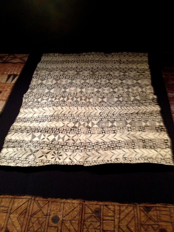
Part of the Theatres of the World exhibition, this room houses bark cloths (mostly) from the South Pacific. Some of them are monumental in size. The richness of colour and pattern is astounding. 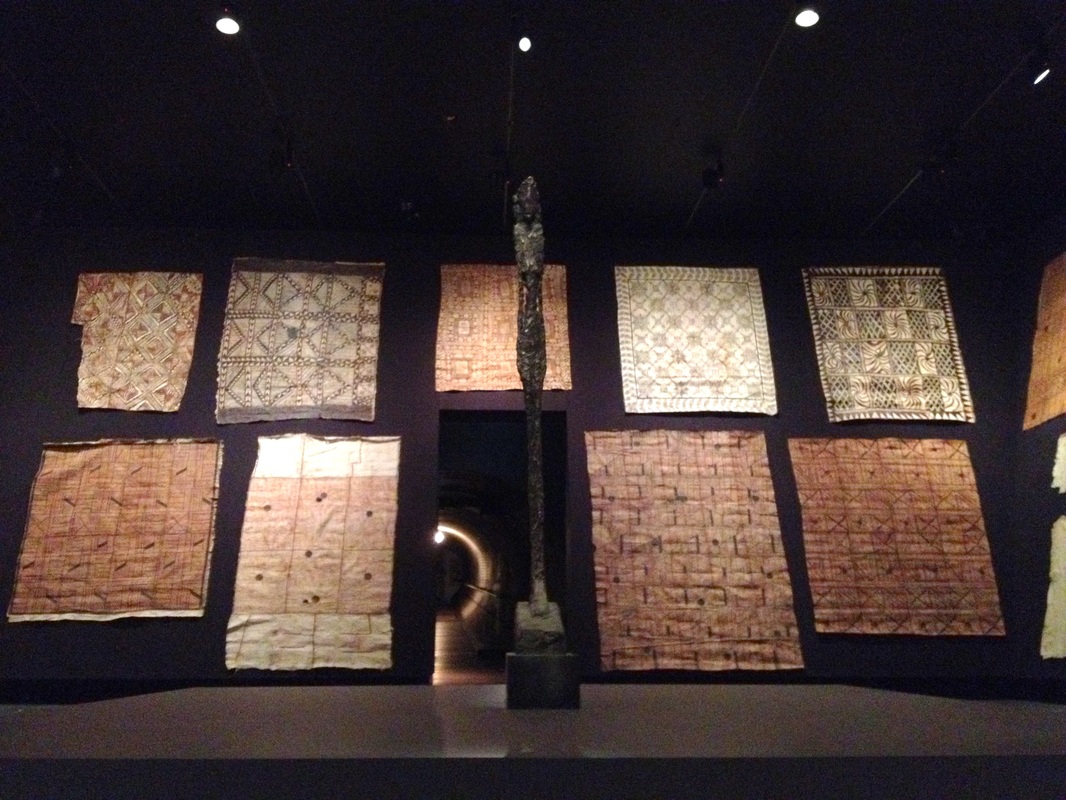
Above: the far wall of the room. In the foreground is the superb sculpture Grande Figurine (Femme Leoni), 1947, Alberto Giacometti 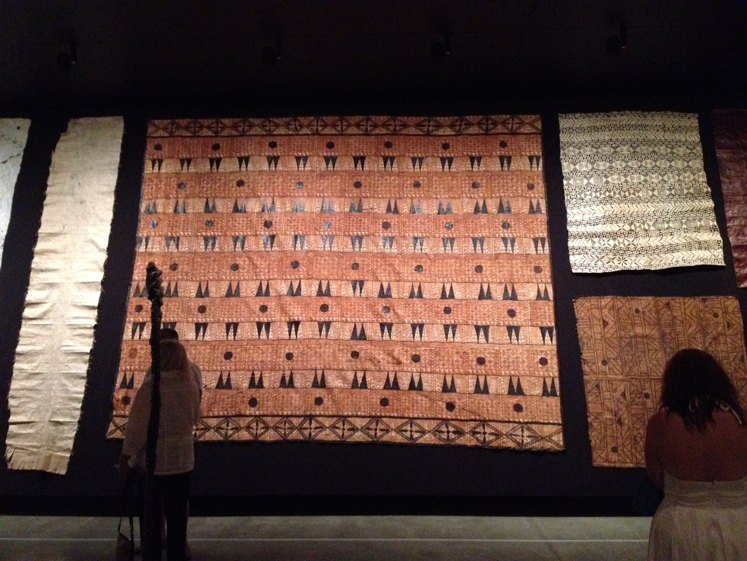
This photo gives you some idea of the scale. The large work in the centre is about 4 metres by 3.5 metres. 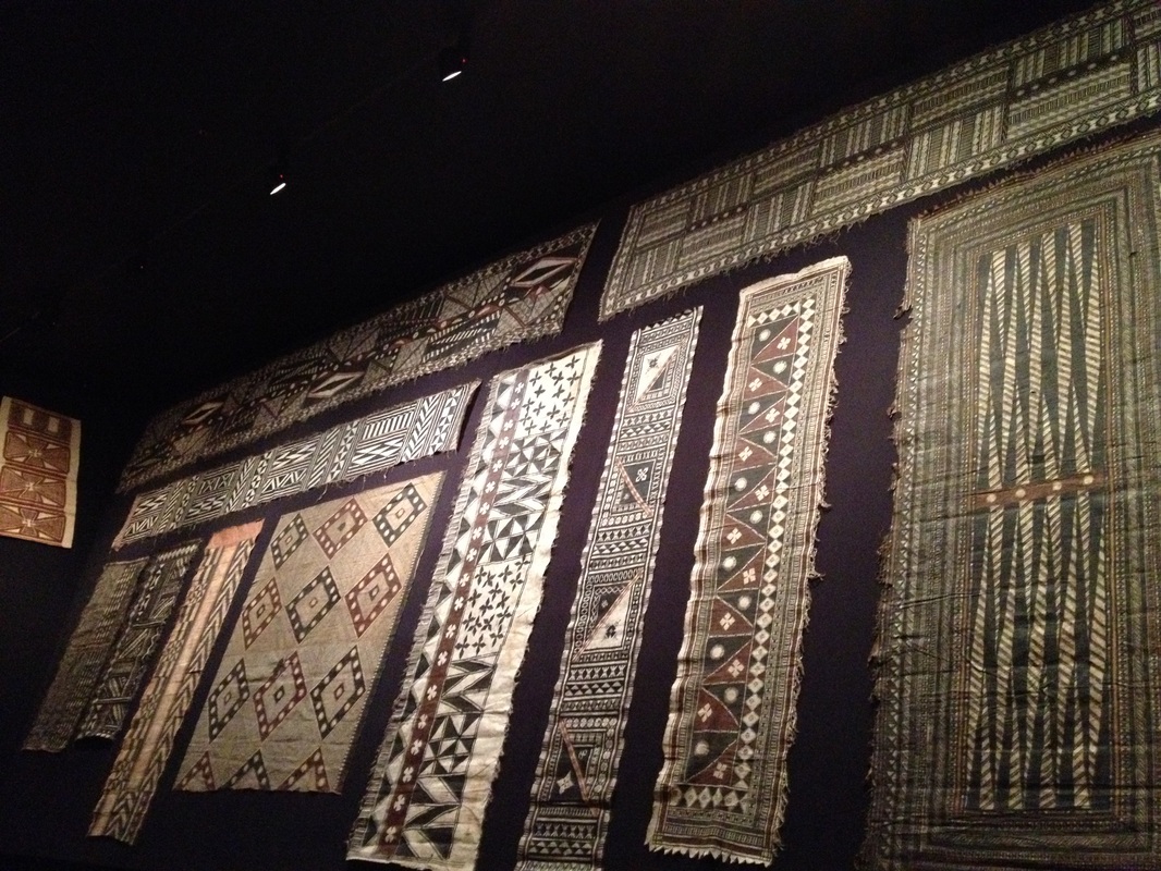
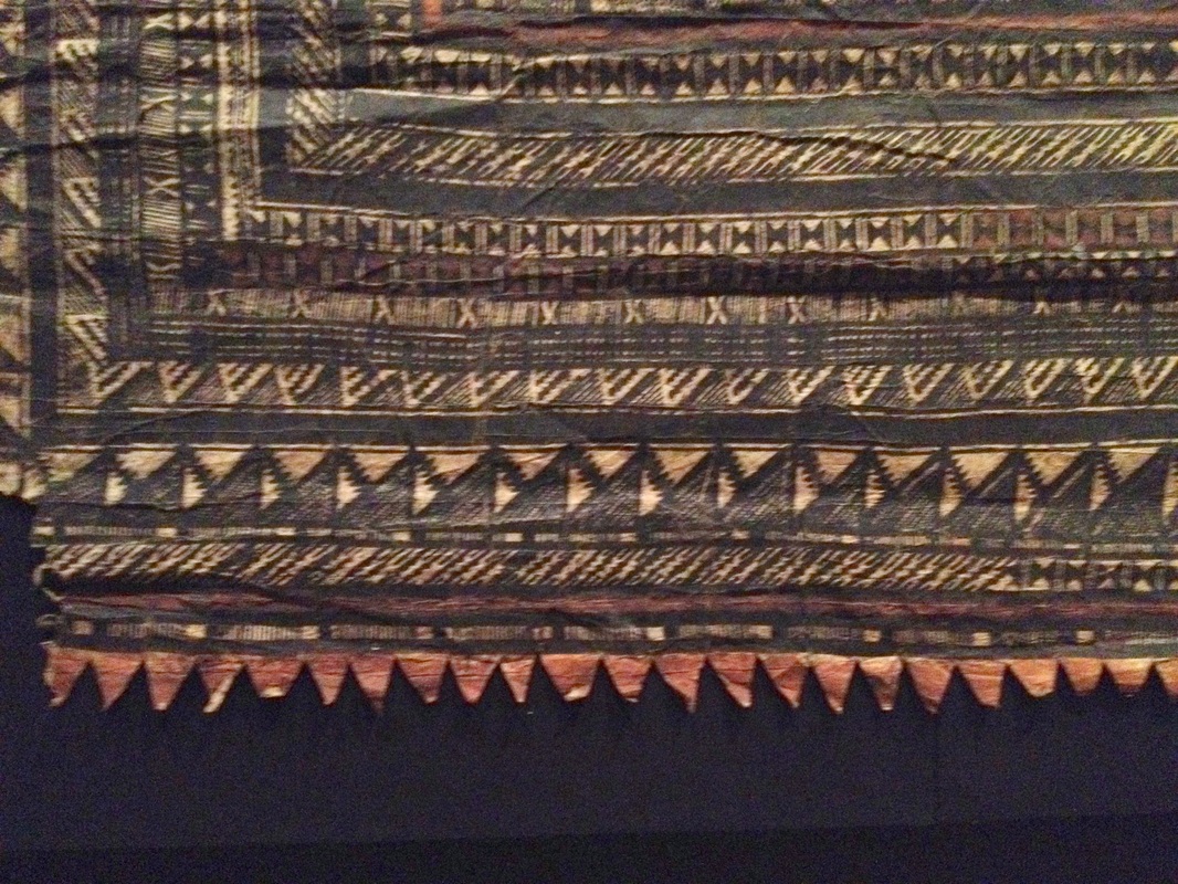
Some of the cloths are covered in complex and intricate detail.................. 
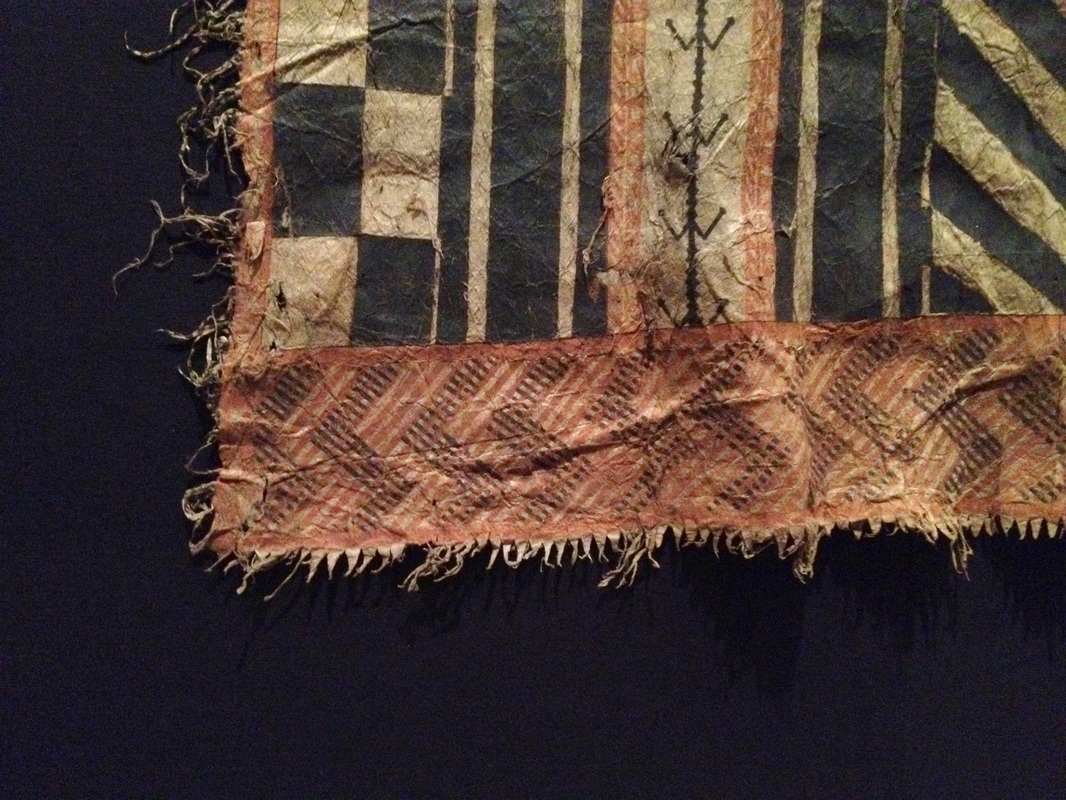
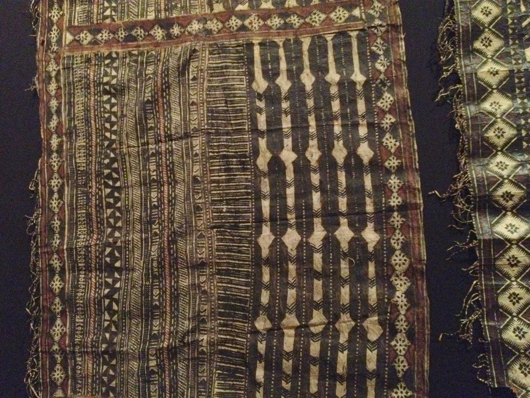
......some are more minimalist............ 
..and a few are not decorated at all - the beauty of the cloth standing alone. 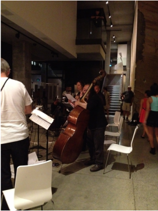
During our chat Nick told me that the work comes together in the last hour and a half and reaches its climax in the last 17 minutes. In fact, the last 17 minutes were composed first and the work built backwards from that point.
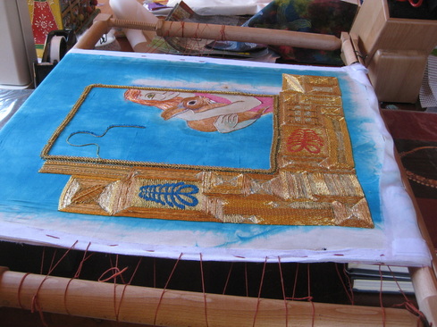
So, I made my way back to hear the last 1 hour and 45 minutes. Again, a sense of time was lost. It may have passed in a minute or in a lifetime. All I know is that when the final quiet notes sounded I was alive with a sense of inner well being and quietude that had been lacking for some time. My creative drought was over. It's been a while since I posted an update on this work (you can read the previous post here). Progress has been intermittent. Truthfully, I find the gold work both tiring and a little boring after a while. It doesn't help that the area to be covered is so large! I have completed 2 sides of the gold work border. Each side is 10 cm wide and it is a large piece, so covering it all in gold work is quite a task. 
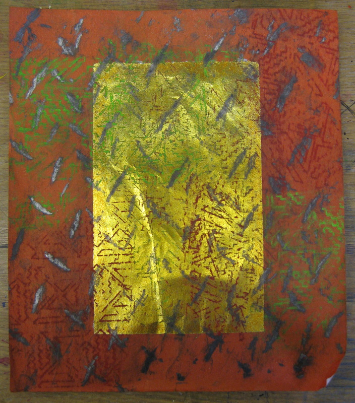
The photo above gives you an overview thus far. Below I are a series of photographs showing the work from different angles to give you an idea of how the light affects the appearance of the gold work. 
The angle at which the work is viewed changes the direction of the light and brings out different patterns within the work. 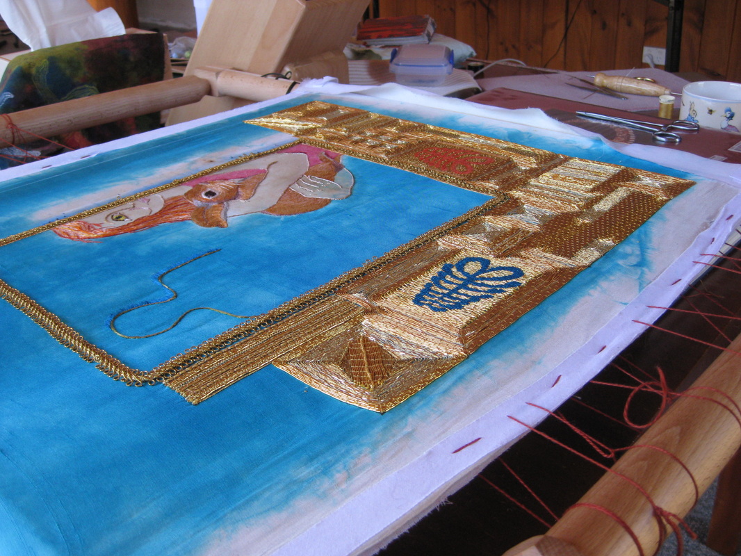
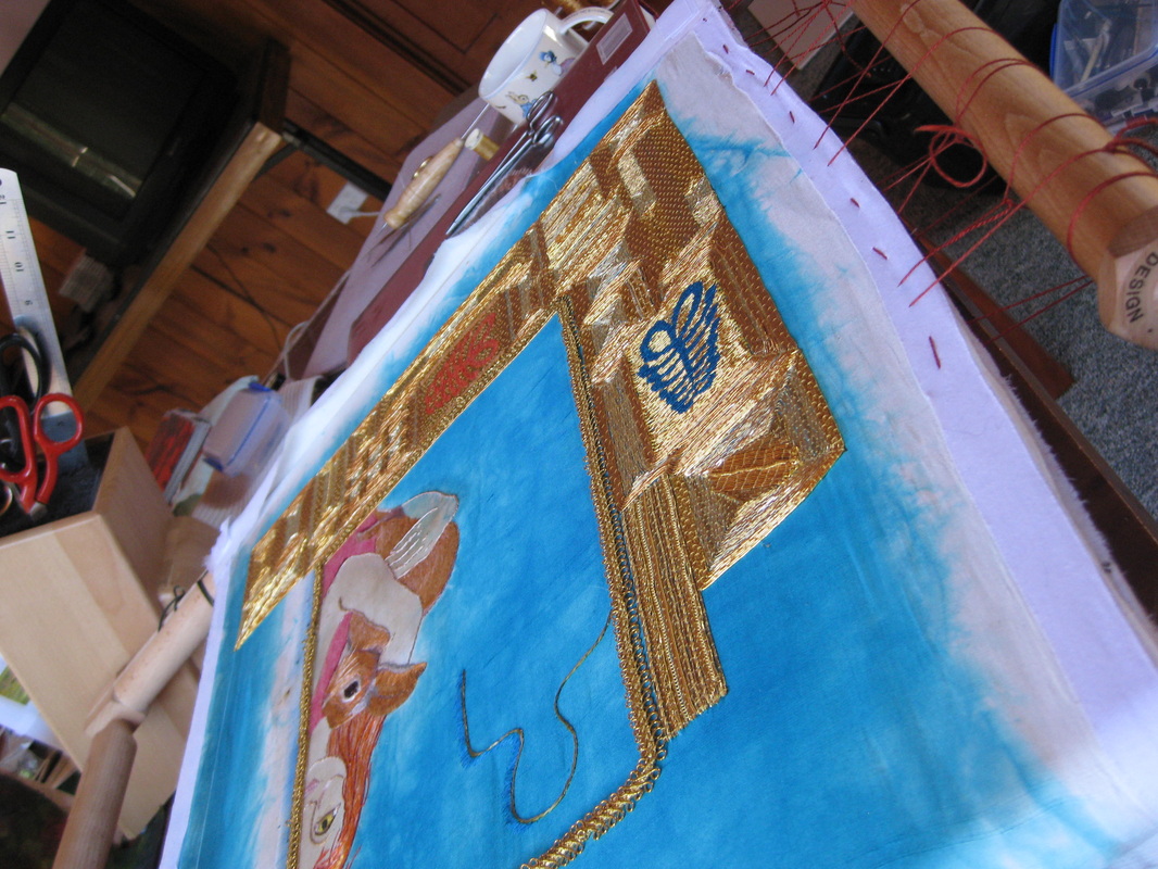
This shot shows off the different colours of gold within the piece. 
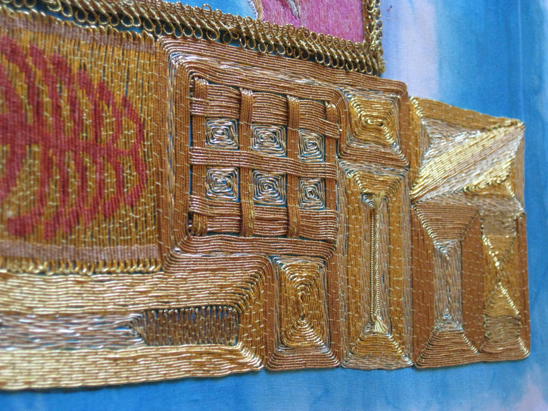
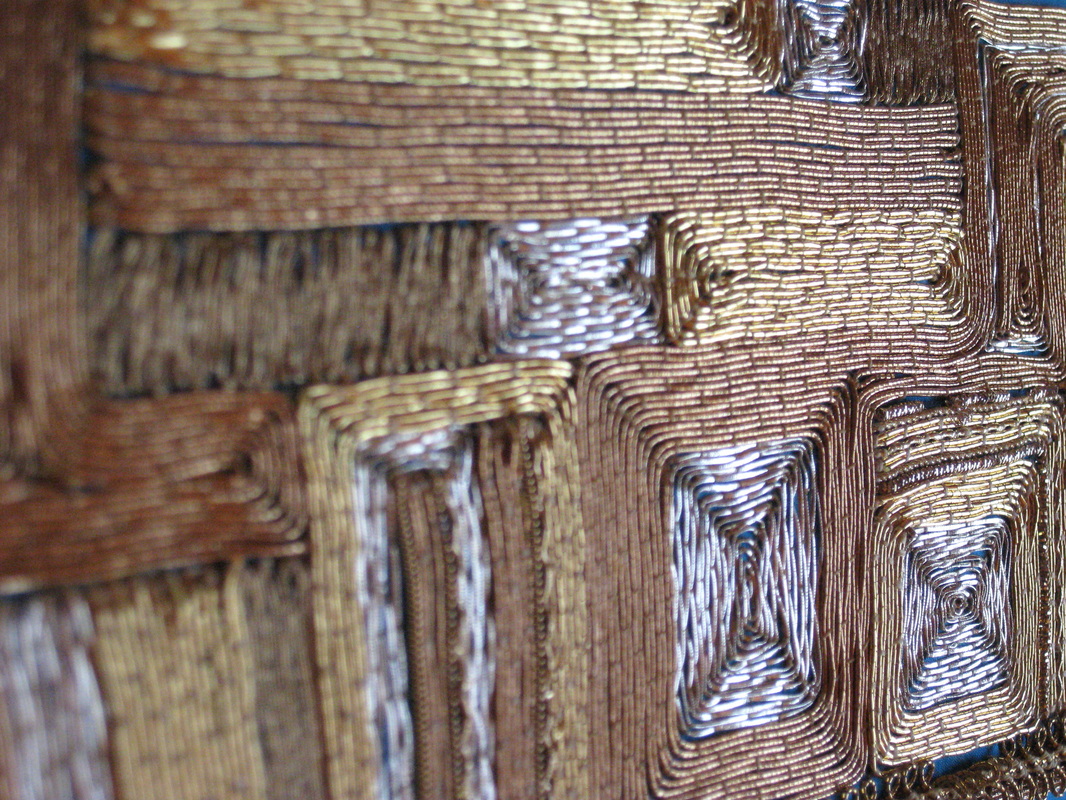
My gold work technique is ever improving, particularly with regard to placement of the couching stitches. 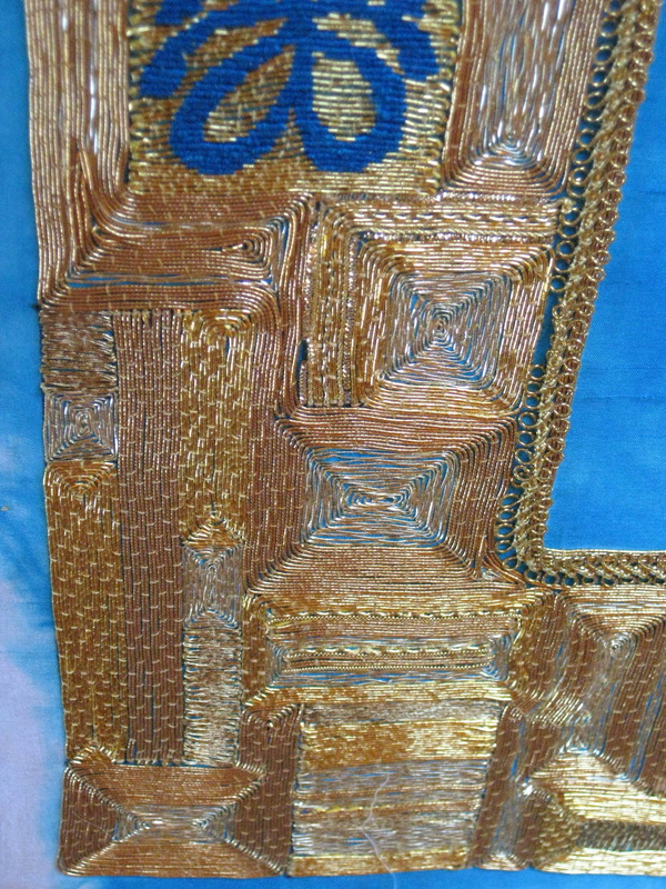
So, that's where I'm at. What do you think?
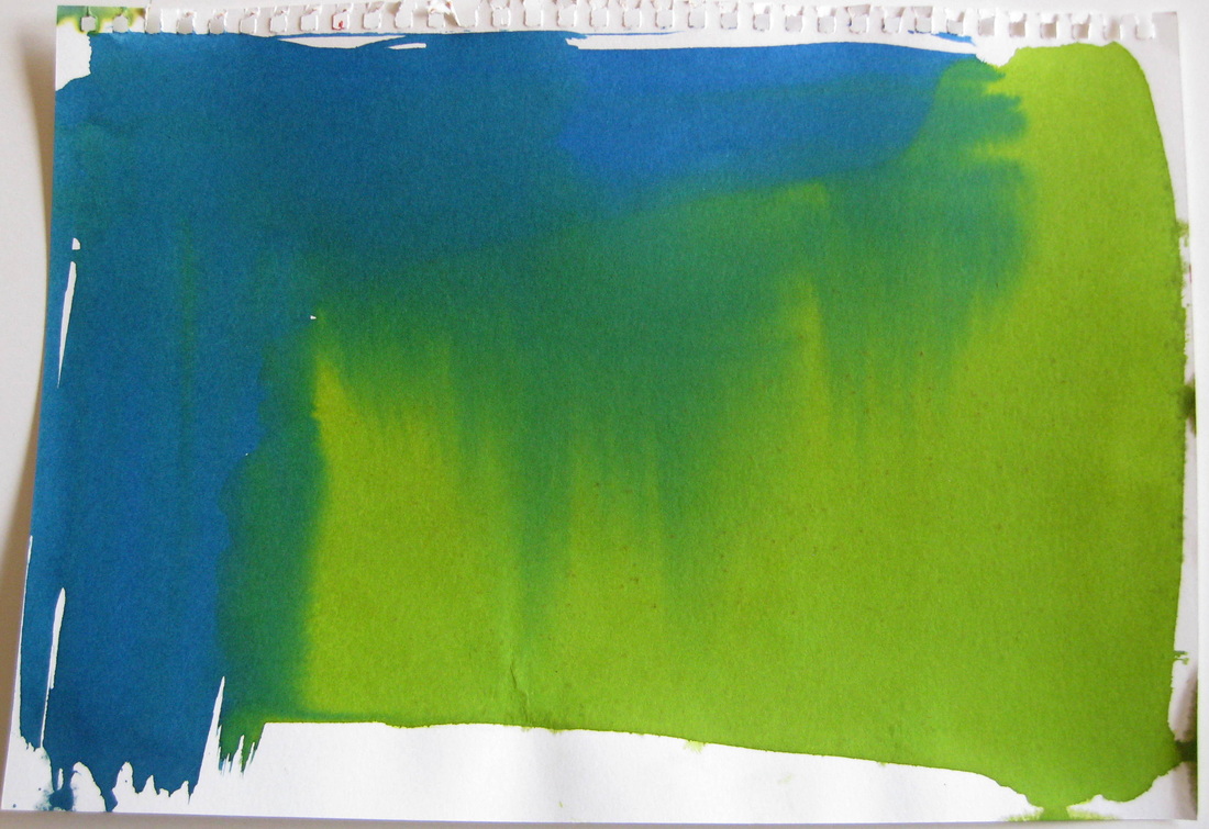
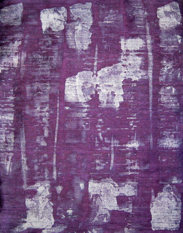
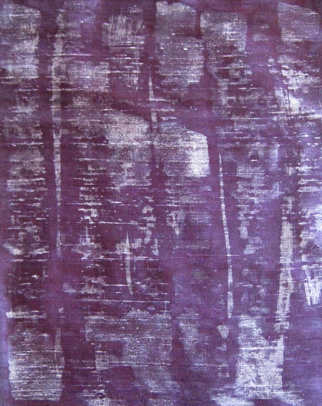
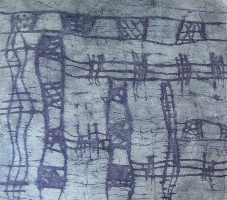
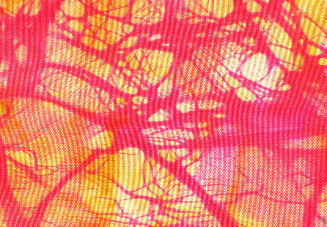
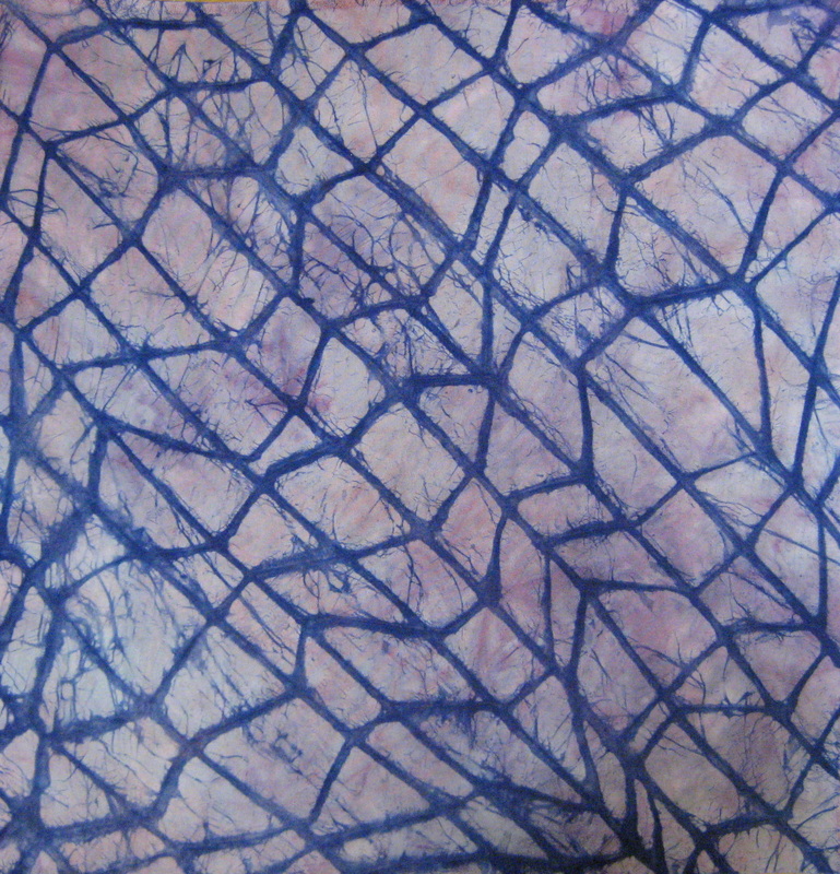
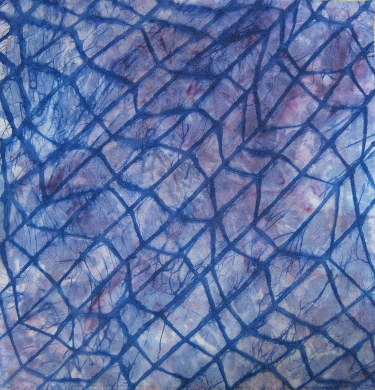
After the Tony Dyer workshop (see previous post here), there were a lot of techniques that I was keen to experiment with. One of those techniques was one he didn't even demonstrate, but described while showing some images of his work. The technique was a kind of reverse batik where wax is painted onto the fabric and then etched into and over dyed. I had experimented with batik, but was not getting the types of results I wanted and this etching technique sounded like it might be the trick. A couple of weeks ago my friend Carolyn came and spent a few days in my studio and together we embarked on an experimentation adventure.
This piece is a gorgeous silver indian dupioni fabric that is really textured and slubby. I painted the wax on with a wide brush and then over dyed it. Both sides are interesting, although because of the highly textured surface of the fabric the fine brush lines created as the wax on the brush was spent do not show up very well.
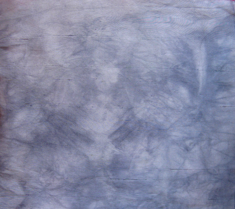
On the left is a piece of 19mm habotai under dyed with landscapes dyes. On the right: after etching and over dyeing with procion mx.
This is a fine, chinese dupioni (much less textured and slubby than the first piece). I had problems with the wax cracking as I etched it on this piece. I think I will try heating the etching tool when I want really fine defined lines.
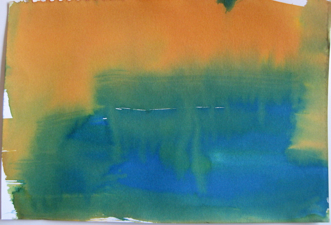
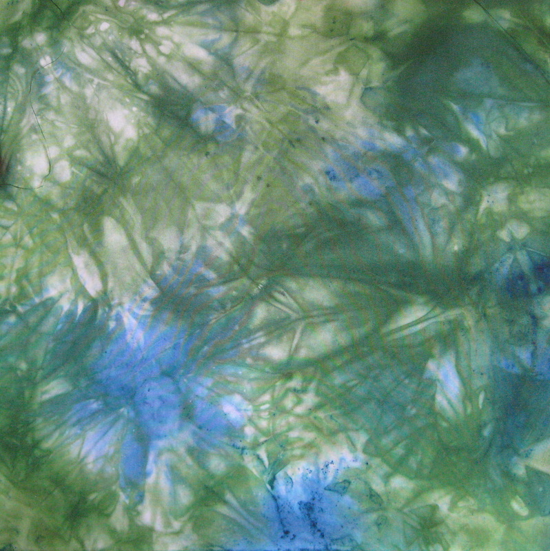
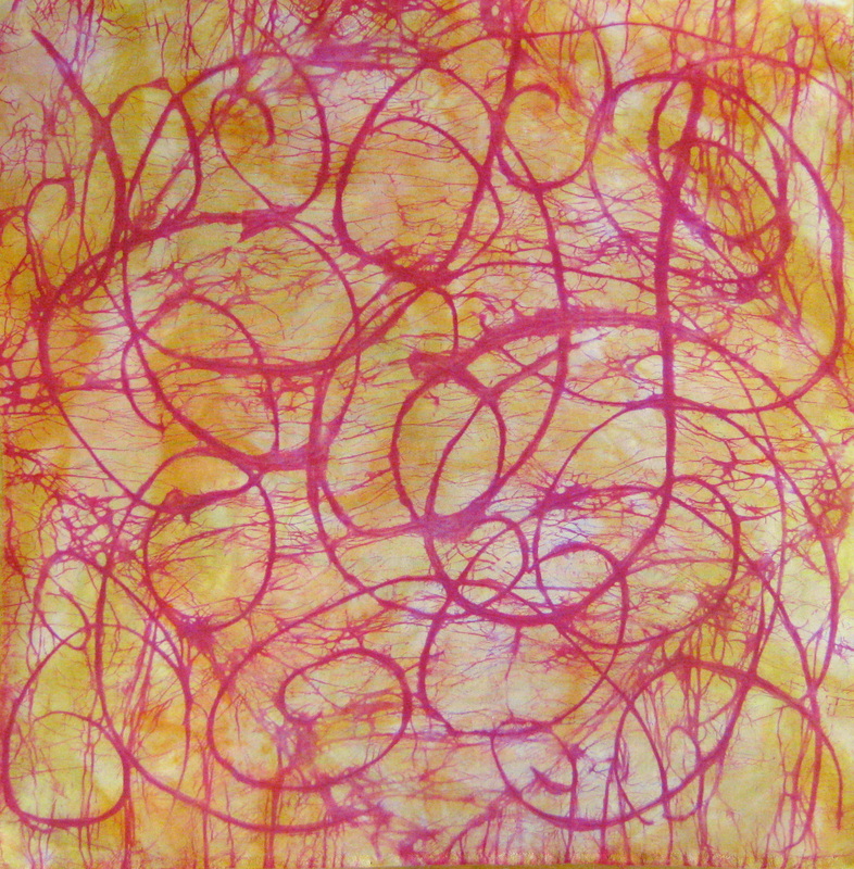
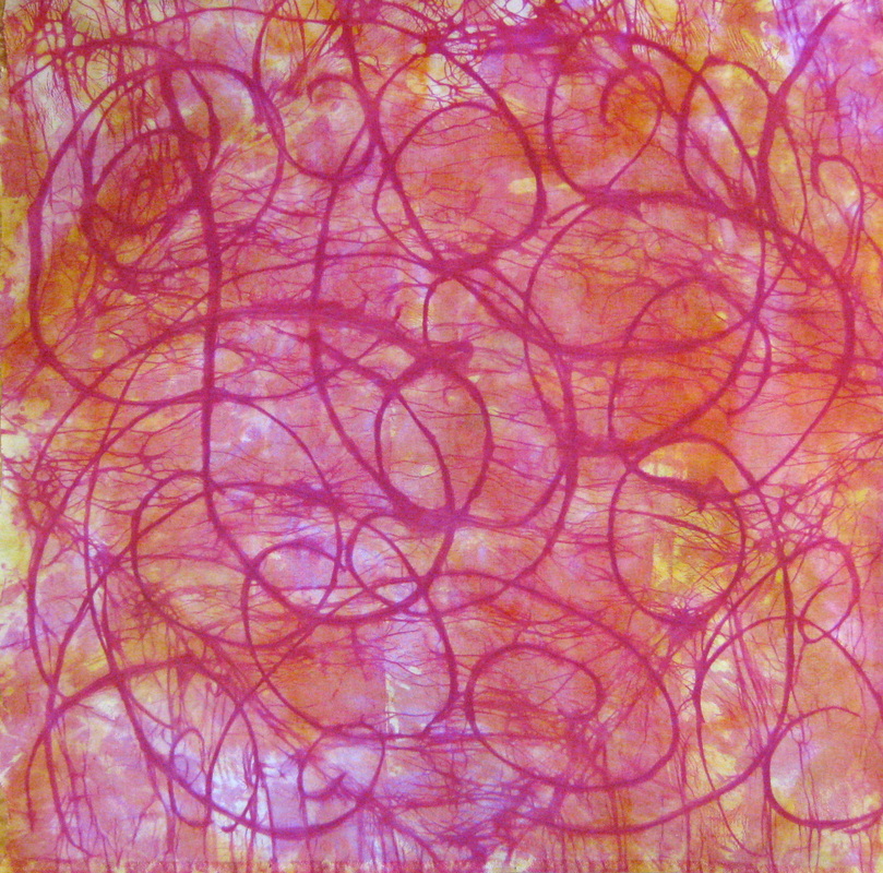
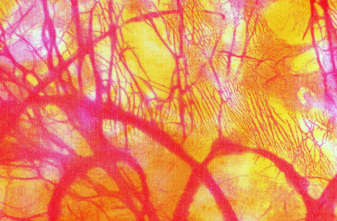
I love how this one worked out. It is under dyed with yellow and orange landscapes dyes, etched and over dyed with procion mx red 8B. You can see that much more of the red dye works its way through the wax on one side than the other, I have no idea which side, though.
After etching I crumpled the fabric so as to get some crazing patterns. These close ups show it off really nicely.
These photos show the process. Left: fabric under dyed, Right: Fabric waxed and turned over so that the marks created by the cling wrap underneath are on top.
Left: after etching over the cling wrap marks; Right: after over dyeing with procion olive dye. 
In this one I have over dyed with 2 different colours, one on each half of the fabric. I love this piece and it will be the basis of an art work coming soon. 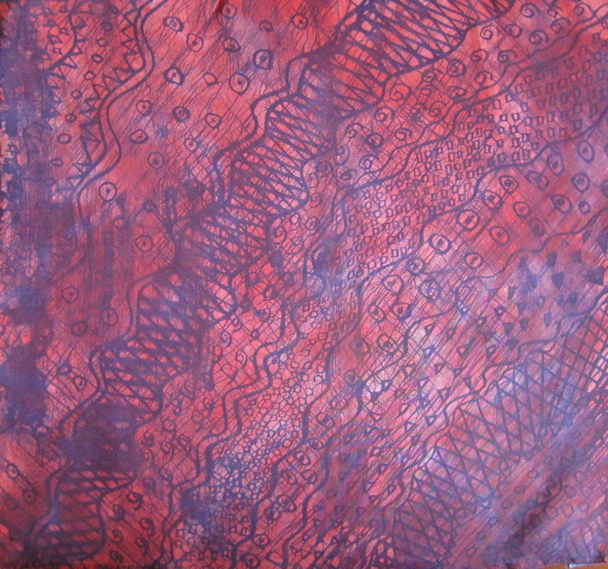
Here's a couple of Carolyn's experiments with wax etching..... 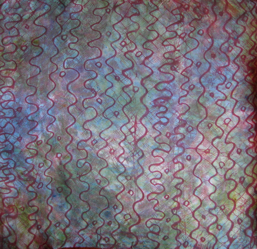
Carolyn also experimented with break down printing with fabulous results.
A few weeks ago I had the pleasure of participating in a "mark making on paper" workshop run by Caroline Amos on behalf of Stitching and Beyond members. Caroline's artworks are divine and she proved also to be a wonderful teacher. 
On day 1 we began by exploring making a variety of marks with ink and with graphite. We then explored making rubbings with graphite, using resists and creating drawings using highly textured photographic images for inspiration. On day 2 we used the materials developed on day 1 to create a collage piece. 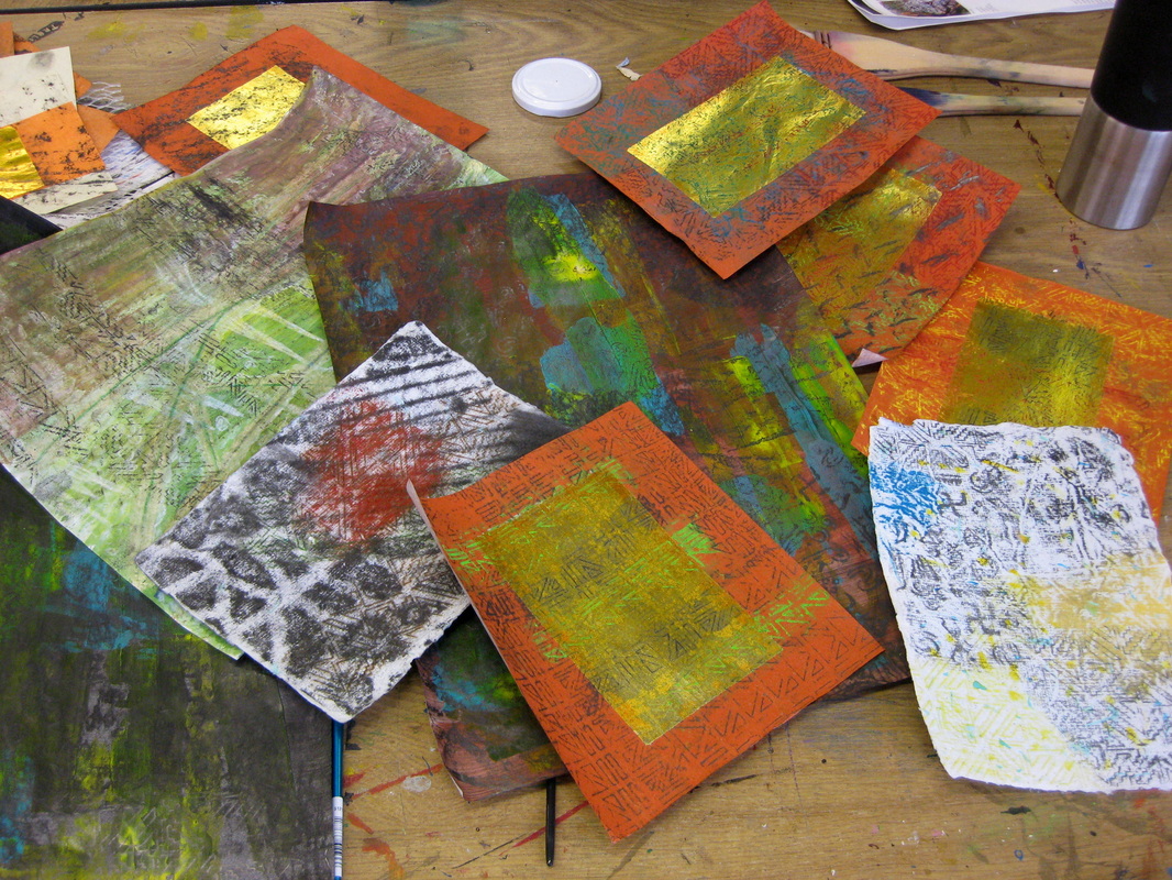
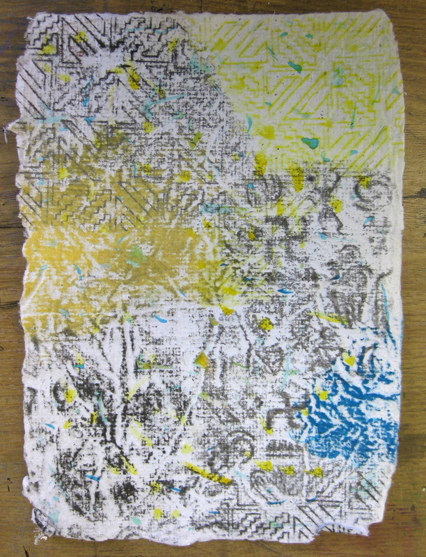
On the morning of day 2 I looked at what I had in my stash from day 1 and, frankly, it was rubbish! I had nothing of interest at all! Not to be defeated, I set about in a frenzy of activity to transform my wealth of nothing into something usable. Pictured above you see what I had at the end of my efforts. 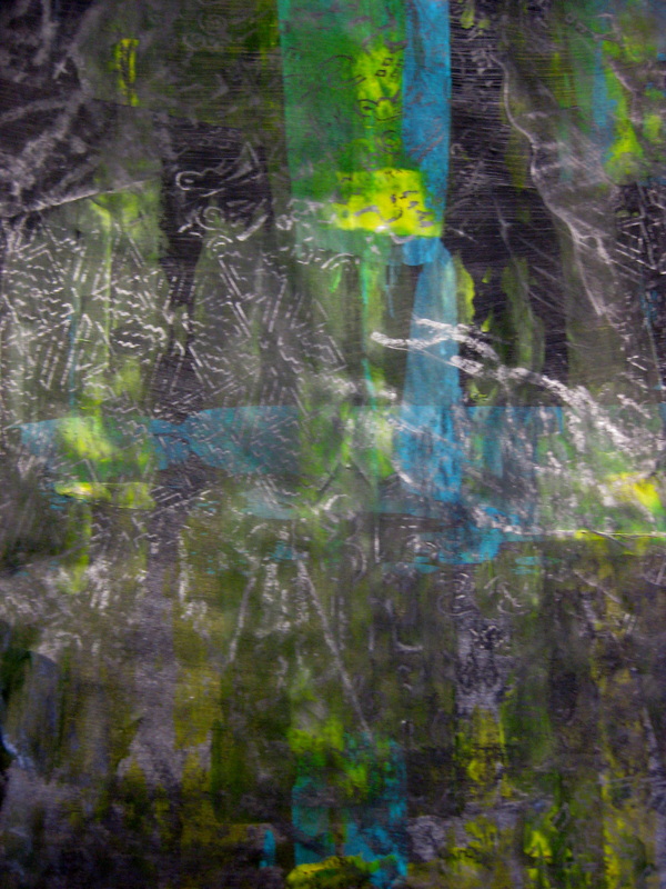
On day 1 we did an exercise where we painted a sheet of paper in a single colour with tonal values varying from very light to dark. My pieces were not graduated enough and looked pretty boring. I took this black one and scraped some blue and yellow acrylic paint across it. After drying I then took some wood blocks and made graphite rubbings over the top. 
This is a piece of my own handmade paper. The rubbings I had done on day 1 just made it look dirty. I discovered that with a hard graphite stick, some chalk pastel and some wood blocks I could get some more defined marks. 
Another piece of paper painted on day 1 with rust coloured acrylic, overlaid with blue and yellow acrylic paint and graphite rubbings. 
This was the drawing I did on day one using inktense pencils, Koh-i-noor progresso pencils, lumigraph pencil and Shiva oil sticks after I reworked it and overlaid it with some graphite rubbings. 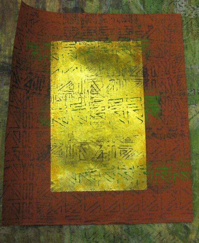
Chinese Joss paper rubbings made with wood blocks and graphite and chalk pastel. 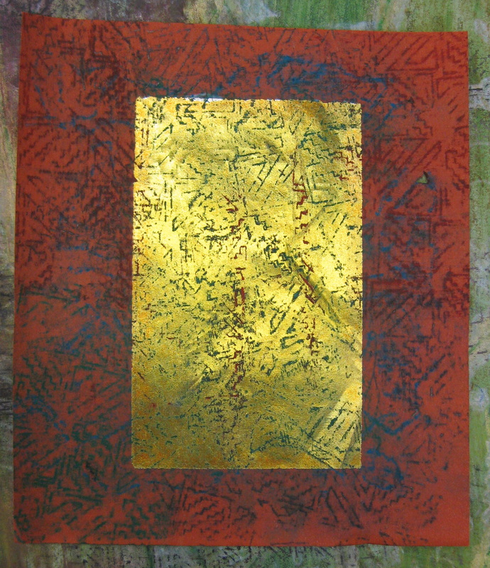

...more hand made paper 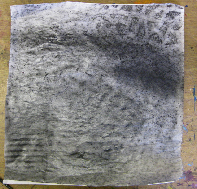
Graphite rubbings onto newsprint, using both graphite powder and graphite sticks of varying hardness, and then lacquered with a water based clear estapol. The lacquer makes the paper quite leathery and seals the graphite. It gives the paper a really interesting quality that decreases its fragility and allows you to tear it, glue it, or even stitch into it without damaging it. 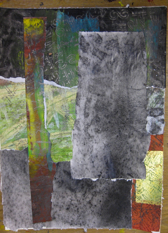
By the end of day 2 I had 2 collaged pieces with the potential for further development (pictured above and below). 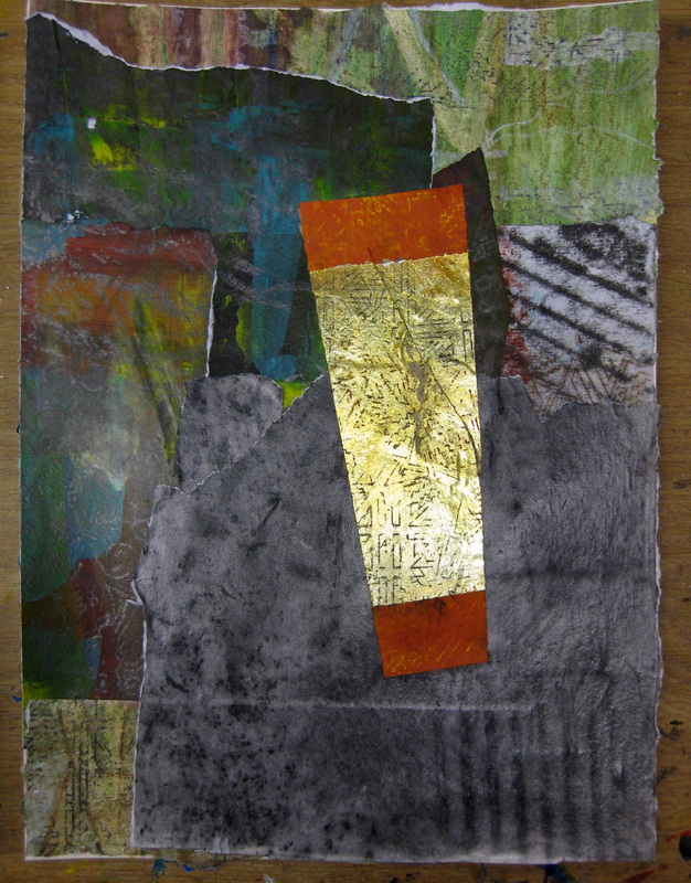

When I got back to my studio I reworked over the collage with black progresso pencil to make the collage more cohesive and less "raw" looking. On this one you can see that I have already punched holes for stitching into. 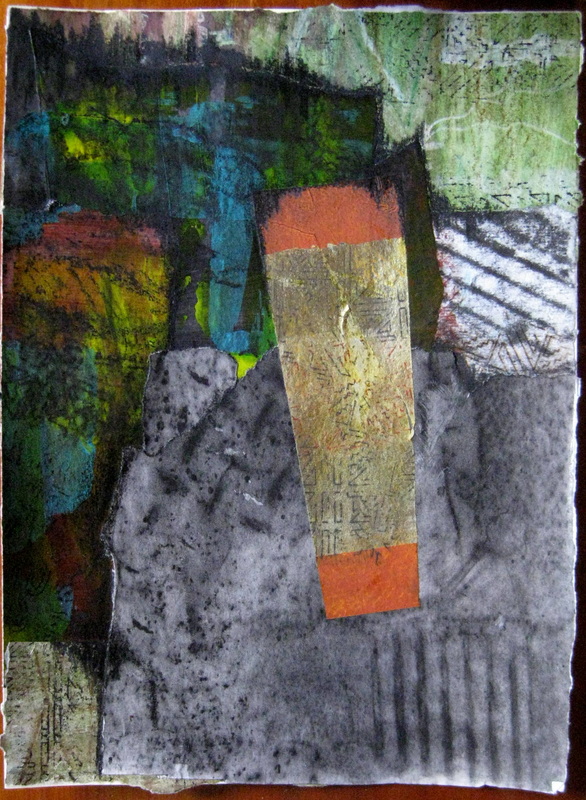
The second piece reworked. 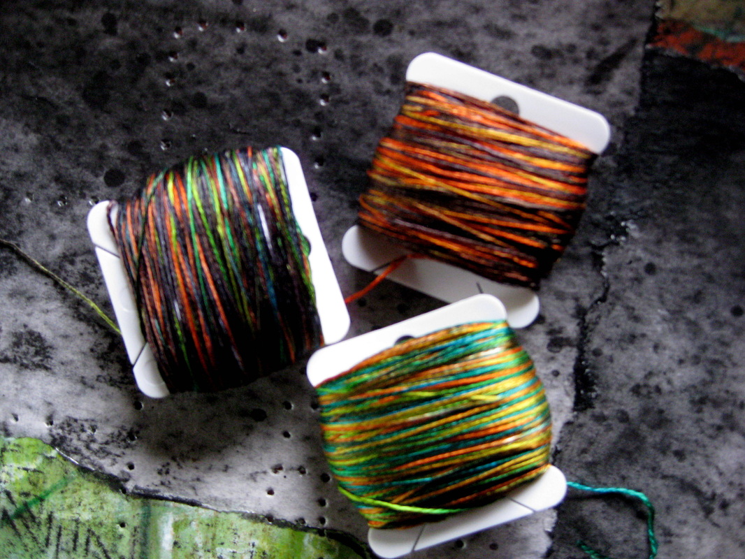
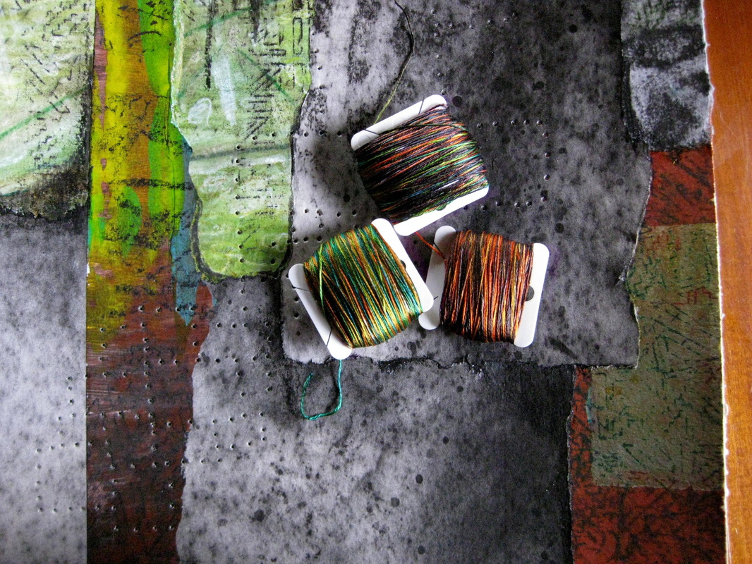
Variegated silk threads ..... 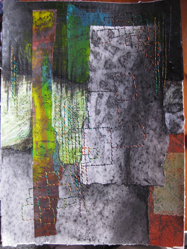
After stitching I felt that the large squares in the centre were not bold enough..... (you need to click on the photo for a larger image to see the stitching better). 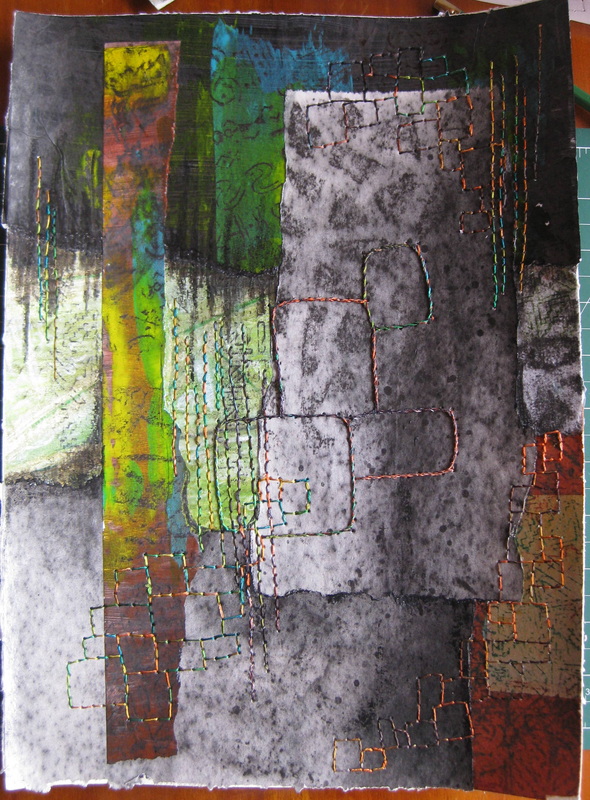
.....so I whipped over the double running stitch twice to make them bolder.
I got so much out of this workshop. If you have a chance to do one of Caroline's classes I highly recommend that you jump at it. Not only was it great on its own, but this workshop really complemented the Tony Dyer Workshop I did the following weekend (blogged previously here). I recently had the immense pleasure of participating in a textile printing workshop taught by accomplished Australian textile artist, Tony Dyer. The workshop was held over two days at the Maker's Workshop in Burnie, Tasmania. Day 1 involved dyeing some fabrics, both silk and cotton, with Procion Mx dyes. 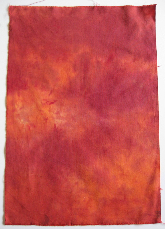
These samples were dyed using two colours poured into a zip lock bag and smooshed through the fabric. 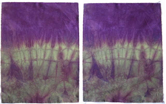
The above sample was my fabulous and unexpected surprise. I have photographed both sides of the fabric to show that dyed fabrics have 2 sides which have a different appearance giving you the option of choosing the one that appeals the most. 
Soft contrasts achieved on cotton muslin. 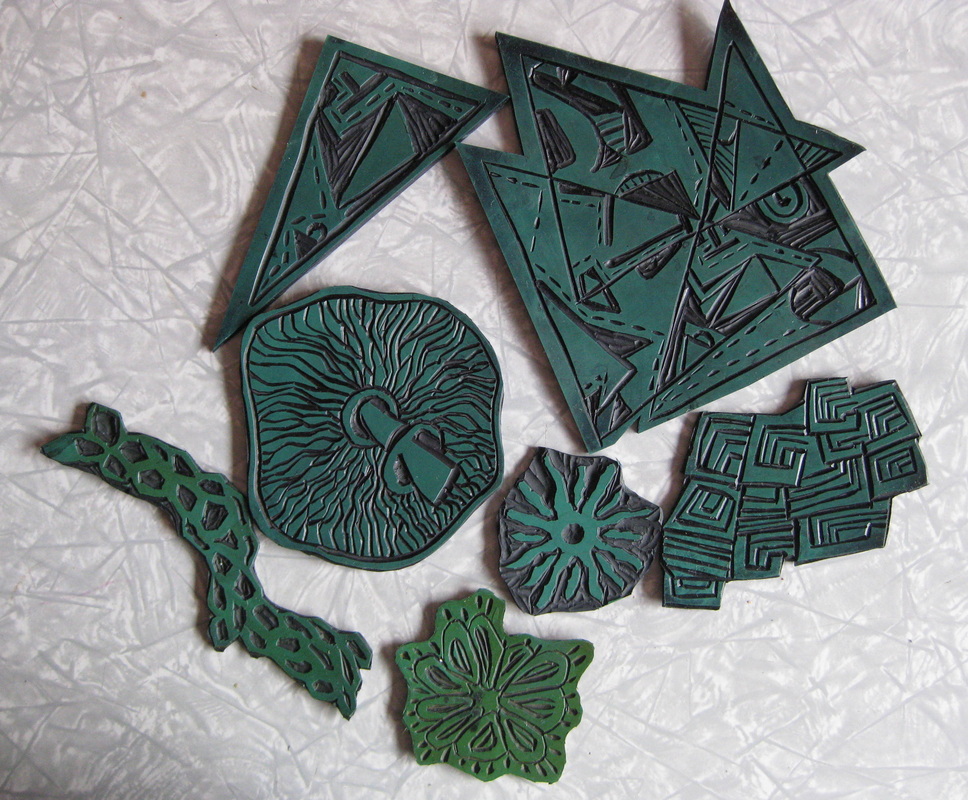
We did a variety of design exercises using an existing textile as a reference. My piece was an embroidered cuff from the Chinese Hmong people. It had very geometric elements from which I created the top 2 lino cuts based on triangles. We were to use our lino cuts to create printed fabrics on day 2. Feeling that my 2 triangular lino cuts would limit my scope on day 2, I went home in the evening and cut five more designs. 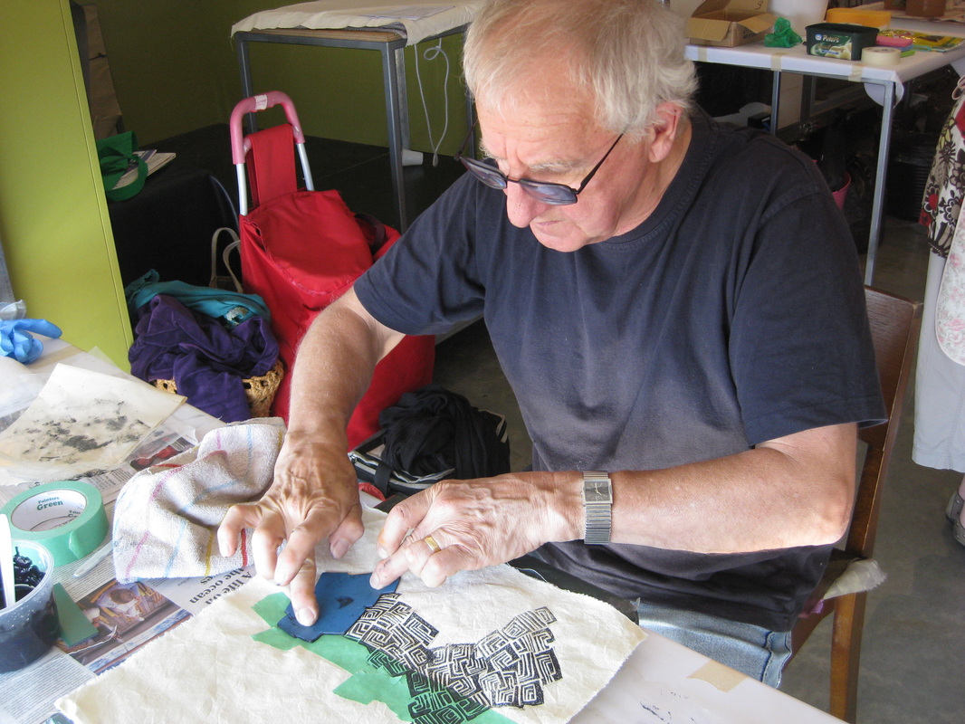
Here, Tony demonstrates how to create a complex print using my lino cuts and creating a negative space by masking of the middle of the fabric. 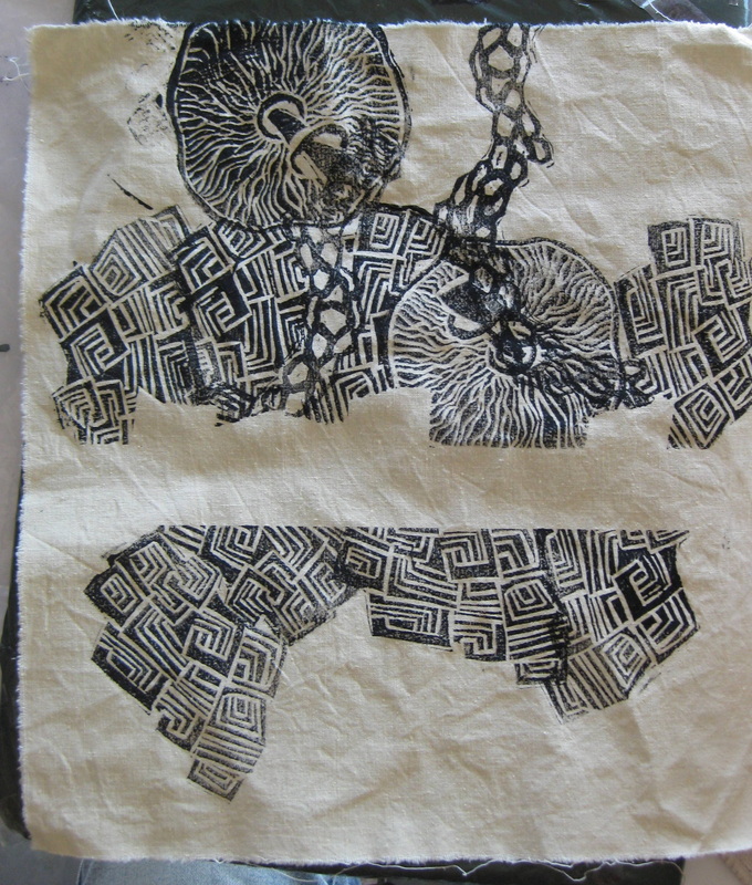
In progress....... 
Here's how it looked finished. I added a few more stamps - which printed poorly but gave a better balance. I then painted on the dyes over the top of the printing. Before painting I masked out the white area which links the lines of the narrow curved stamp. The colours were much lighter when they fixed and dried, which was a bit disappointing because they were really dark and lush when wet. But still looks ok, I think. 
This is a piece of fabric I dyed in a large bucket of dyed. Interestingly the dye was an olive green colour, but an idiosyncracy of Procion Mx dyes is that they can, and often do, disperse into the colours used to mix the solid colour. It was rather washed out and looked like a rag that I had used to wipe up spilt dye. 
Here's how I transformed that ugly piece of fabric! This piece is destined to be the front panel for a wrap skirt. I was really please with the fine detail I achieved with the mushroom stamp. 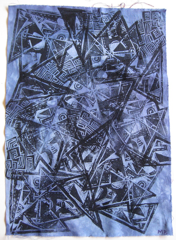
Complex pattern created with my 2 triangle prints allowing extensive overlapping. 
Print on silk with textured background created by monoprinting. 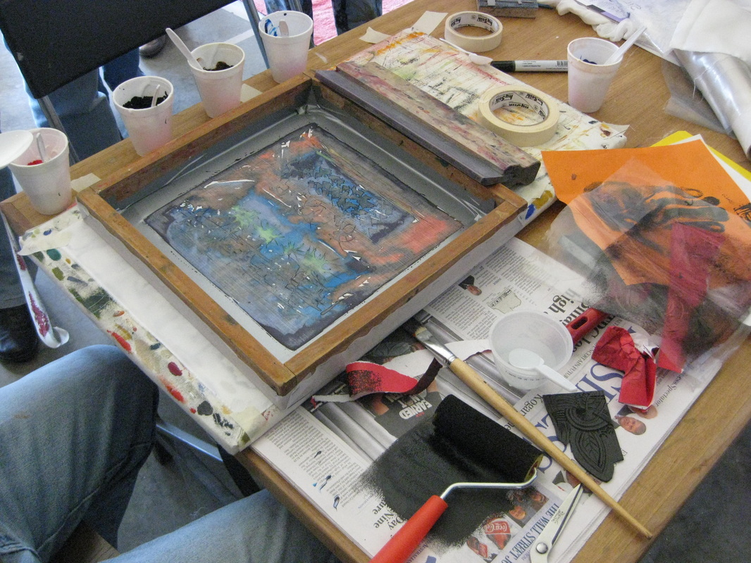
Tony demonstrated the technique of polychromatic printing. A design is first painted onto the right side of the print screen using Procion Mx dyes mixed with water only. 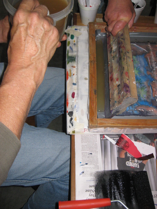
Tony applied manutex to the screen and the design was transferred to the underlying fabric after a couple of pulls. The manutex transfers and fixes the design to the fabric. It has the advantage of maintaining a soft hand after the print dries, an absolute must for those of us working with silk. 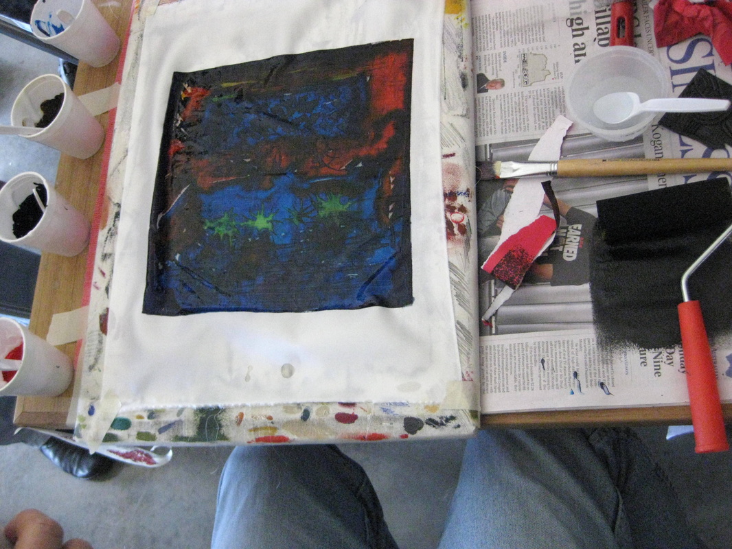
Print successfully transferred to the fabric. 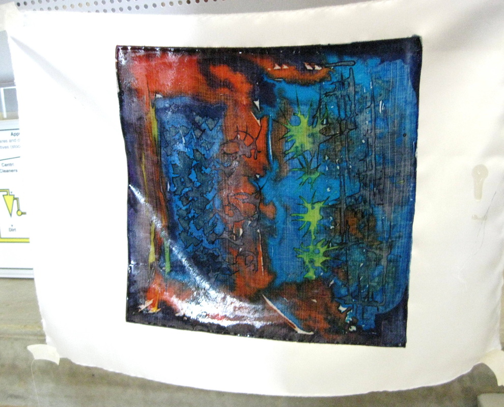
Polychromatic print hanging to dry. 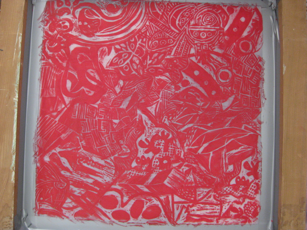
Tony created this design by making wax crayon rubbings directly onto the screen using selected lino cuts from each participant thus forming a snapshot of the activities of the workshop. 
The screen after black printing ink applied. 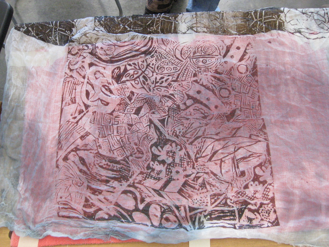
The first print on a piece of muslin. 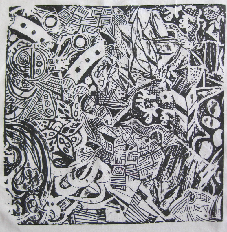
We all promptly lined up to have our own copy printed. Mine is on cotton poplin on which the details become very well defined. I'm not sure what I will do with this yet..... 
Nothing was let go to waste. Left over Procion dyes were painted onto paper. I used this piece as a test strip for my prints. The rest were created in a final flourish just before the end of the class. They will go into my library of papers for use at a later date. 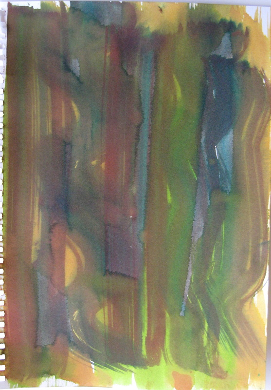

I cannot overstate how fabulous this workshop was. Tony was fantastically generous and I learned an enormous amount both in terms of skills and design development. If you are fortunate enough to have the opportunity to attend one of his workshops, I highly recommend that you participate.
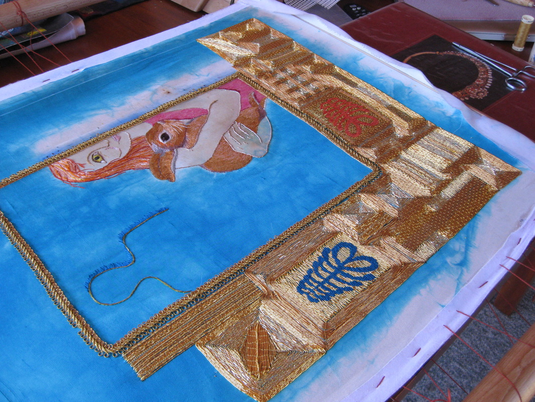
Yikes! It's been almost a month since my last update about this work. I've been very busy with all sorts of things which have taken me away from my studio. As a result progress on my latest work has been a bit slow, but there is still enough going on to show you. 
DAYS 5, 6 and 7 All of the main subject is complete. I pulled out the stitching around the rabbit's eye and reworked it in a more natural looking fashion. Bunny is finished and his front side is more defined as it contrasts with the girl's pink top. The pink of the top brings a dramatic focus to the girl figure and emphasises the almost negative space occupied by the Shadow Man. 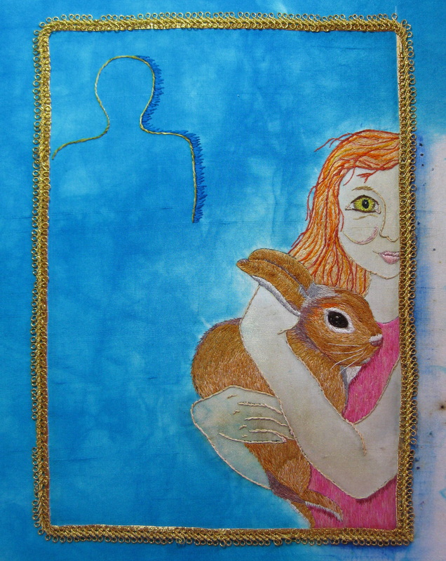
By the end of Day 7 I had added a central frame consisting of 2 rows of couched Japanese Gold thread with an overlying row of layer of antique French gold braid. Time taken to this point: 51.5 hours. 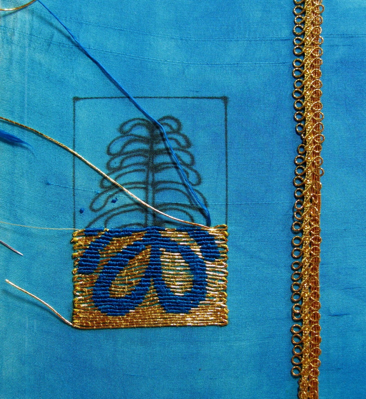
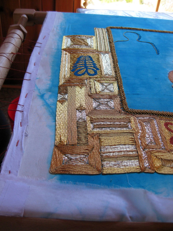
DAY 8: The central area will eventually be surrounded by a 10 cm wide frame of densely worked gold motifs contained within abutting squares and rectangles. It was incredibly difficult knowing where to start as I do not have a defined pattern in mind, but prefer to make design decisions as the work evolves. As with the previous work in this series, I wanted to incorporate an Adinkra symbol that spoke to the subject matter of the work. The fern, or AYA , is the symbol of endurance and resourcefulness. According to The Adinkra Dictionary by W Bruce Willis, "An individual who wears this symbol suggests that he has endured many adversities and outlasted much difficulty." (I will explain the significance of Aya in a future post). By the end of Day 8 I had completed about 1/3 of the Aya symbol. 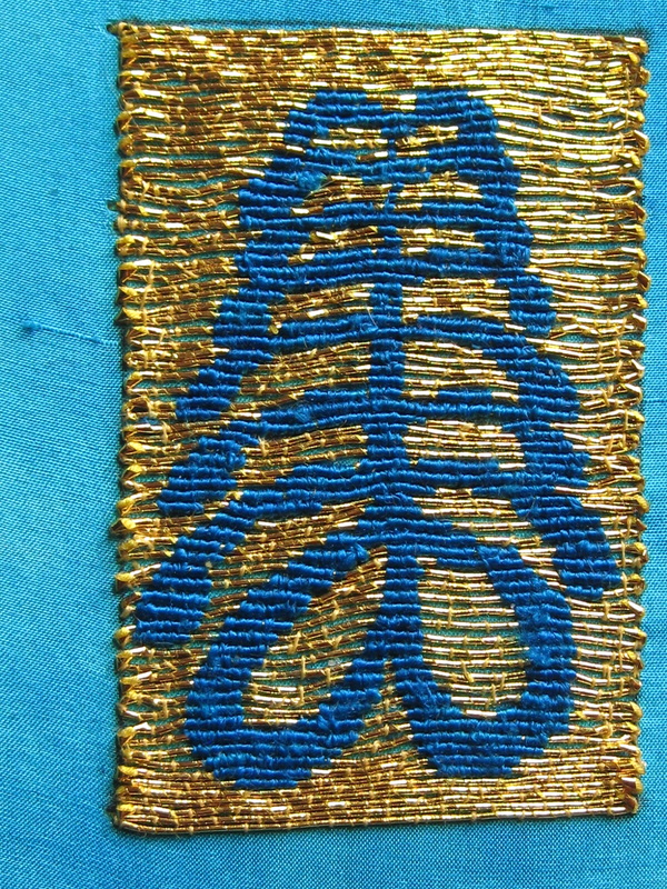
DAY 9: I have worked the Aya symbol in a technique called Or Nue (there should be an acute accent on the "e" but I am not sure how to do that). Or Nue is a technique whereby a motif is stitched over laid gold threads. I used a not too fine flat silk to stitch the fern. Because of the thicknesses of the gold thread relative to the silk and the small size of the design, I ran into some technical difficulties. Ideally, Or Nue should be couched over rows consisting of 2 gold threads. My problem was that if I stitched the motif this way I would lose the finely graduated curves of the fern and the motif would appear more stepped in its lines. I decided to stitch over one gold thread at a time, but as a result the spaces between the gold threads are larger than they should be so that the blue underlying fabric shows through. 
In this close up you can see where the blue peeks through. While goldwork afficionados would no doubt scoff in horror, it's not really a big deal to me as it looks fine to the naked eye. Once it is surrounded by goldwork I think it will be of little consequence. 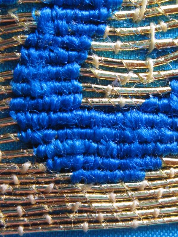
Here in super close up you can see the difference between the bottom gold threads where they lie closely abutted and where the Or Nue begins thus forcing the gold threads further apart. This shot also shows my less than wonderful placement of the gold couching stitches. The stitches should be perfectly spaced between each other in a "brick" pattern and should all be perfectly perpendicular to the gold thread. My stitches lie on varying angles and the brick pattern is not aligned or even. I'm trying to be a bit more precise in this sense, but find that I'm more concerned with the overal appearance and if I have to place a couching thread in a less than perfect position to make sure that the gold threads lie the way I want them to then so be it. Although I strive for technical excellence, I am fairly new to goldwork and am learning as I go. 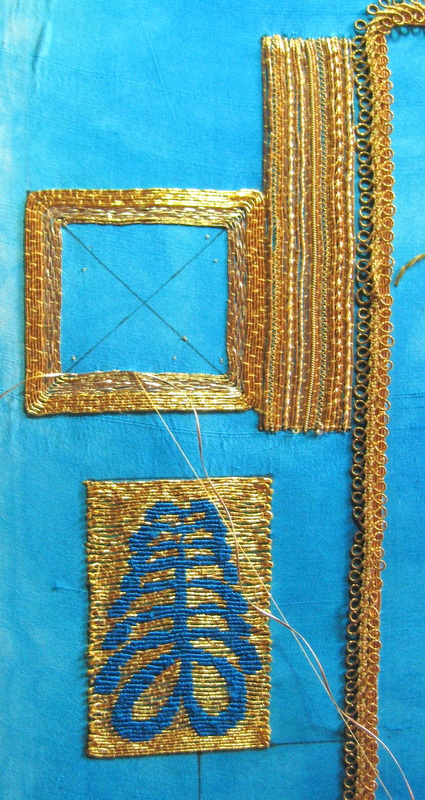
On DAY 10 I drew in the outline shapes for the larger rectangles/squares. The tall rectangle above the fern is worked in parallel lines of a variety of different types of gold thread. 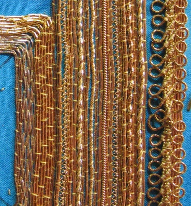
Some of the threads used include, flatworm, Grecian twist (thick and thin), Japanese Gold thread, milliary wire, pearl purl, rococco and large back. Here you get a good look at the antique French braid in the inner frame. 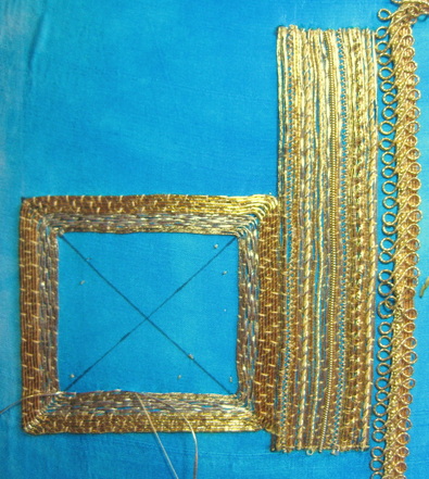
This photo gives a better idea as to the contrast in the different shades of gold. I'm just realising how labour intensive the goldwork border is going to be. Time to this point: 66.5 hours.
I'm thinking I may have to alternate working on this series by doing some less labour intensive works to increase my productivity and allow me to exercise a greater variety of ideas otherwise I seriously risk getting bogged down and disillusioned. Not that I'm not enjoying the goldwork, but variety is the spice of life..... |
This blog was previously at another site. To view older blog posts please click here.
AuthorI am a hand embroidery artist living and working in the rugged and wild Central HIghlands of Tasmania. Archives
October 2014
Categories
All
|


 RSS Feed