|
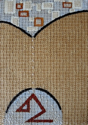
The latest in my Shapes of Life series, "One Too Many" is about how we constantly add to our burdens and obligations. Normally we can keep them suspended, under control and even when we can't we have an "umbrella" that shields us from the deluge. But sometimes we add just that one thing too many and it comes down on us with such force that our umbrella cannot hold it back. Some people can get under shelter before even getting wet while others have to be close to drowning before they realise that beating the same old path is untenable.
I was once close to drowning. It wasn't fun. I've since swum free and dried off. Life is much more fun now.
2 Comments
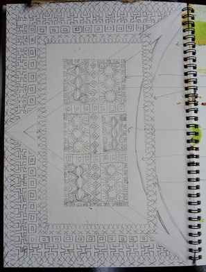
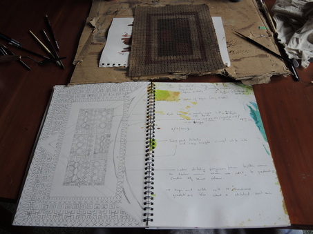
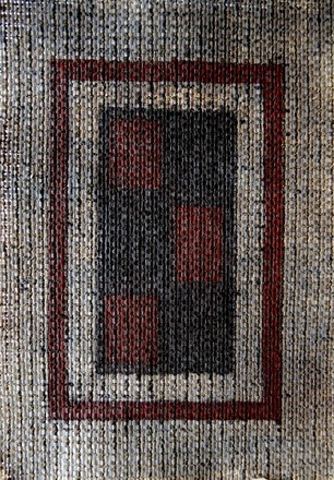
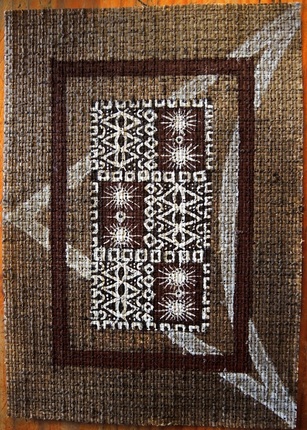
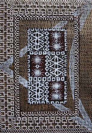
Back from 10 weeks away in Lugano, Switzerland and New York City and I was buzzing with creative drive. I went to my studio, not sure what I would do, just thinking of doing some drawing, exploring a few ideas. Three hours later and I had designed the next in my Shapes of Life Series. Above is the initial sketch of the work. I started with a basic layout of a central element with a border. Then I fleshed out the central portion. I knew I wanted the outer border to be heavily stitched, but not all the way around. I took half of the diamond shaped motif (see top left, centre panel) and enlarged it so that it intersected the entire page. Yep, that was going to work. You can see that my journal is not of the glorious-artist-journal-as-artwork type. My sketches are messy and on the right page you can see my thoughts on how each section should be worked pencilled in roughly. Above the journal and in the photo below is the first painted stage of the work. The paper colour is darkened with a light wash of sepia ink and then the major structural elements have been painted in with numerous layers of ink. After leaving the work to dry overnight the white details were painted in. I had to mix the white ink with a bit of acrylic paint to get the level of detail required in the centre panel. The ink alone was too watery and soaked into the fibres blurring the lines of the design. This is the finished work. The colours in this image most closely resemble the actual colours. The title "One World" came to me while stitching. I kept thinking about how it looked at once similar to a bark painting and a persian rug. The triangular motif cutting across the work reminded me (after painting it) of the Star Trek symbol for the federation of planets and that I had used it to unify the work seemed most fitting for a work that is influenced by so many elements used across cultures. And so the title "One World" came to mind.
I'm loving working on this series. So many ideas. It's a good thing I bought lots of this paper! |
This blog was previously at another site. To view older blog posts please click here.
AuthorI am a hand embroidery artist living and working in the rugged and wild Central HIghlands of Tasmania. Archives
October 2014
Categories
All
|
 RSS Feed